Photographer training
Click a photo to open it full size. Space flips to the next photo of the same note in the same spot, so two versions of one shot sit right on top of each other. Pinch, or scroll with Cmd held, to zoom; drag to move; the arrows walk the notes. The Grid button at the bottom right, or g, draws the rule of thirds and the X on every photo. Every note has a number, so a question can name the photo.
Part 1
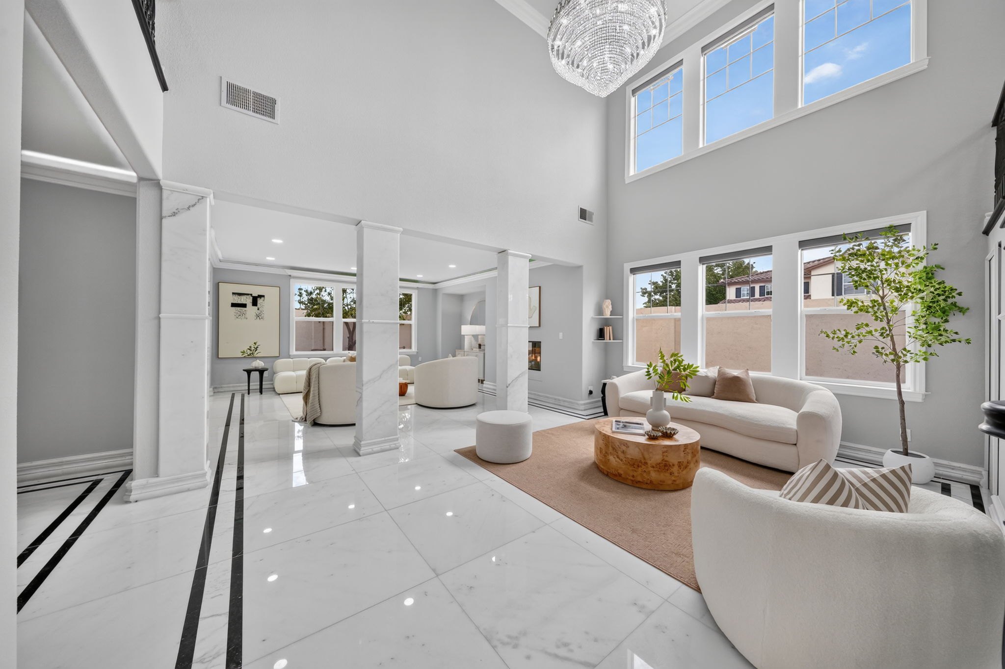
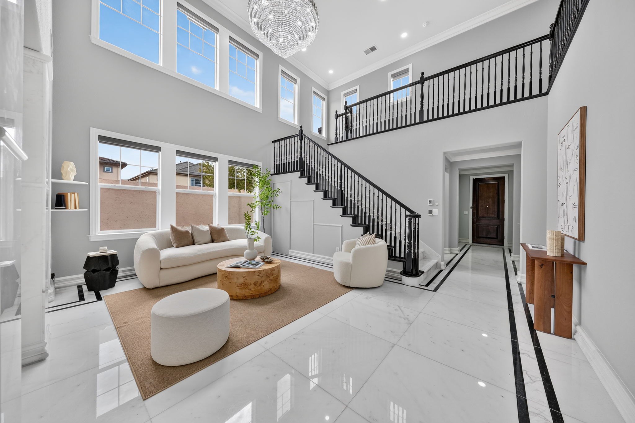
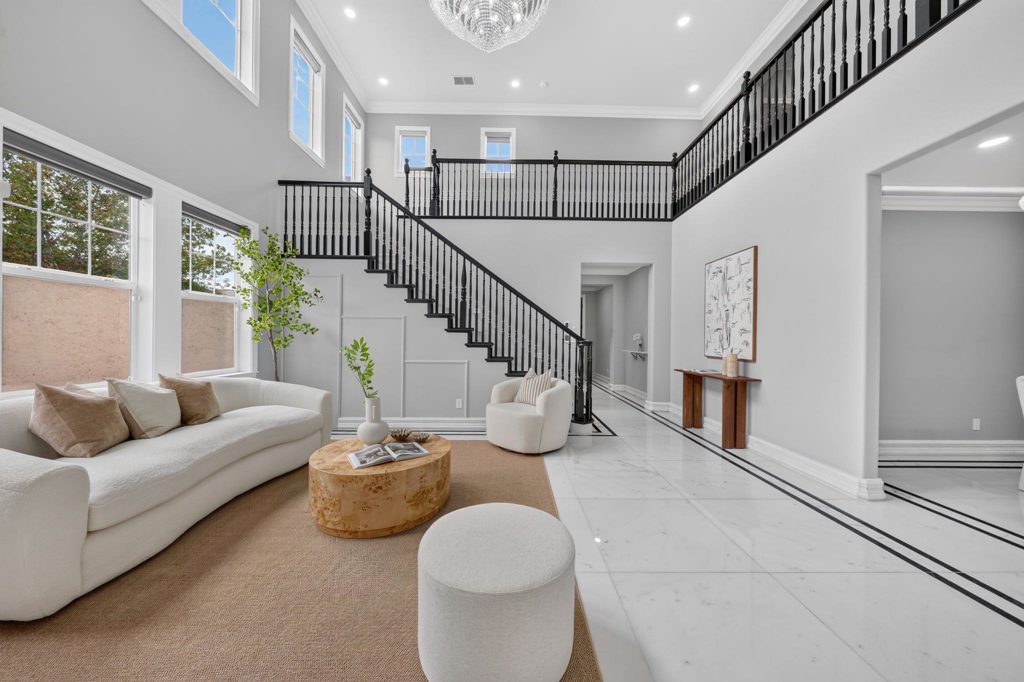
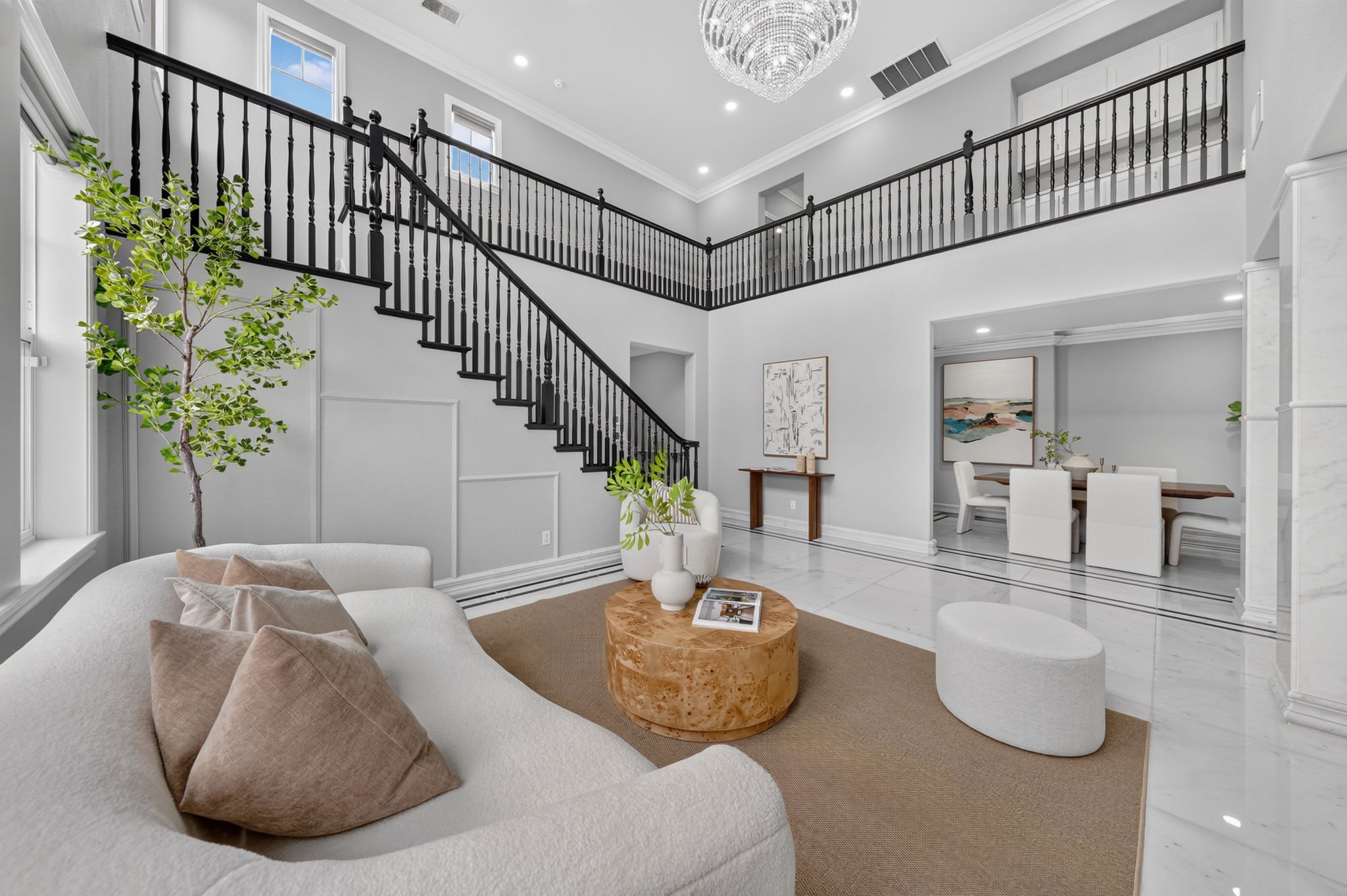
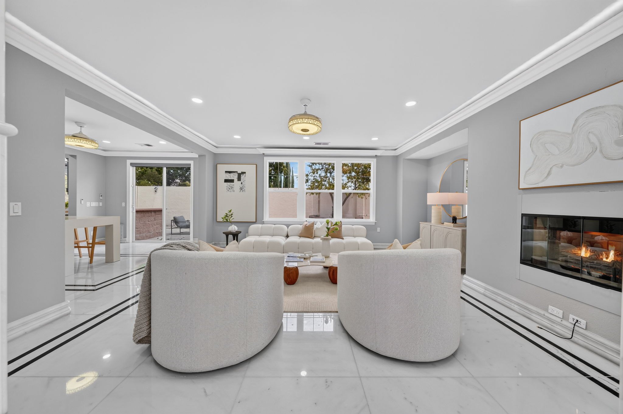
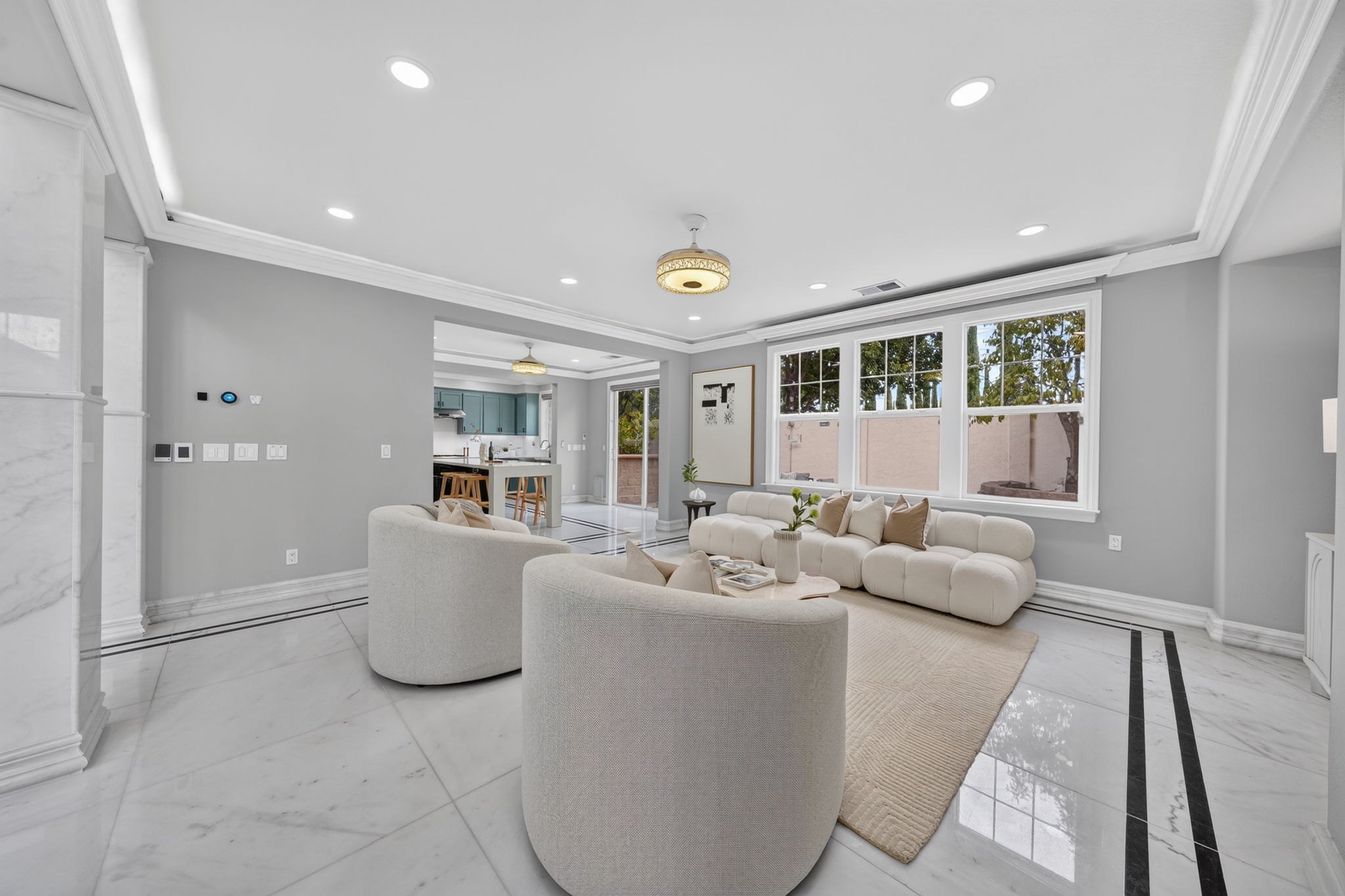
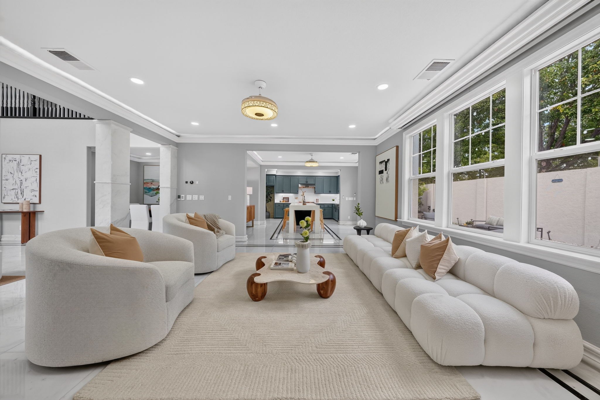
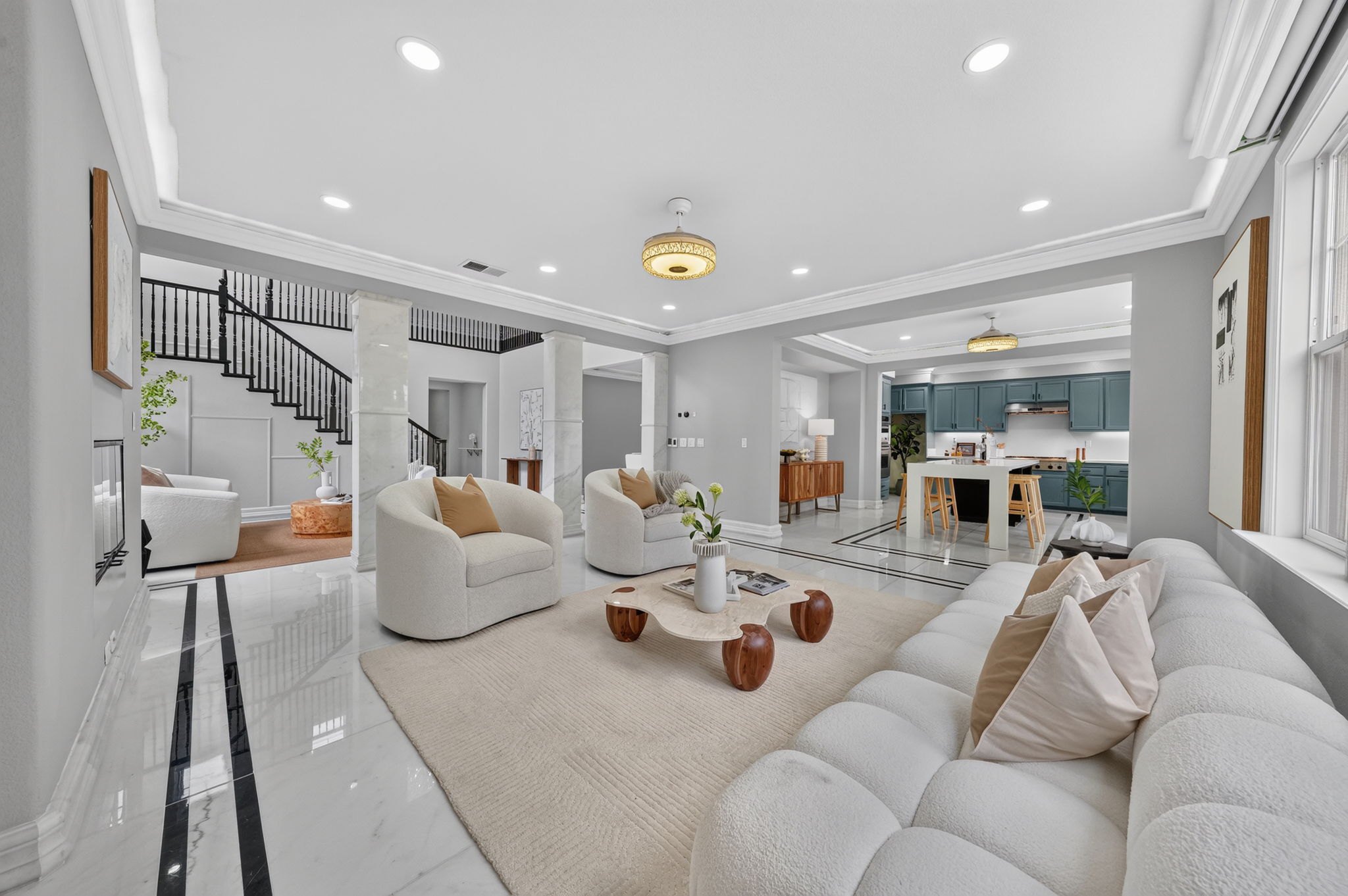
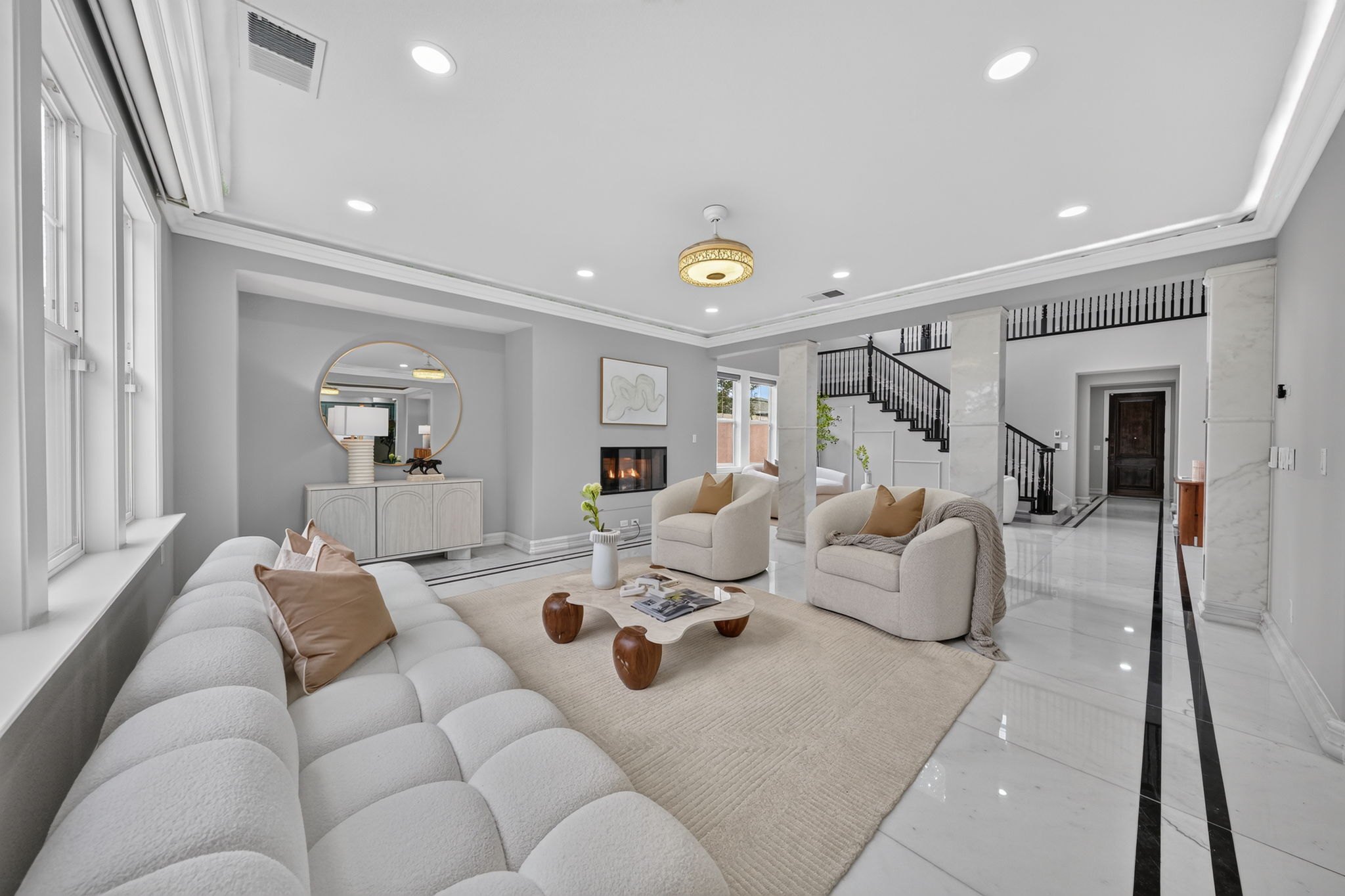
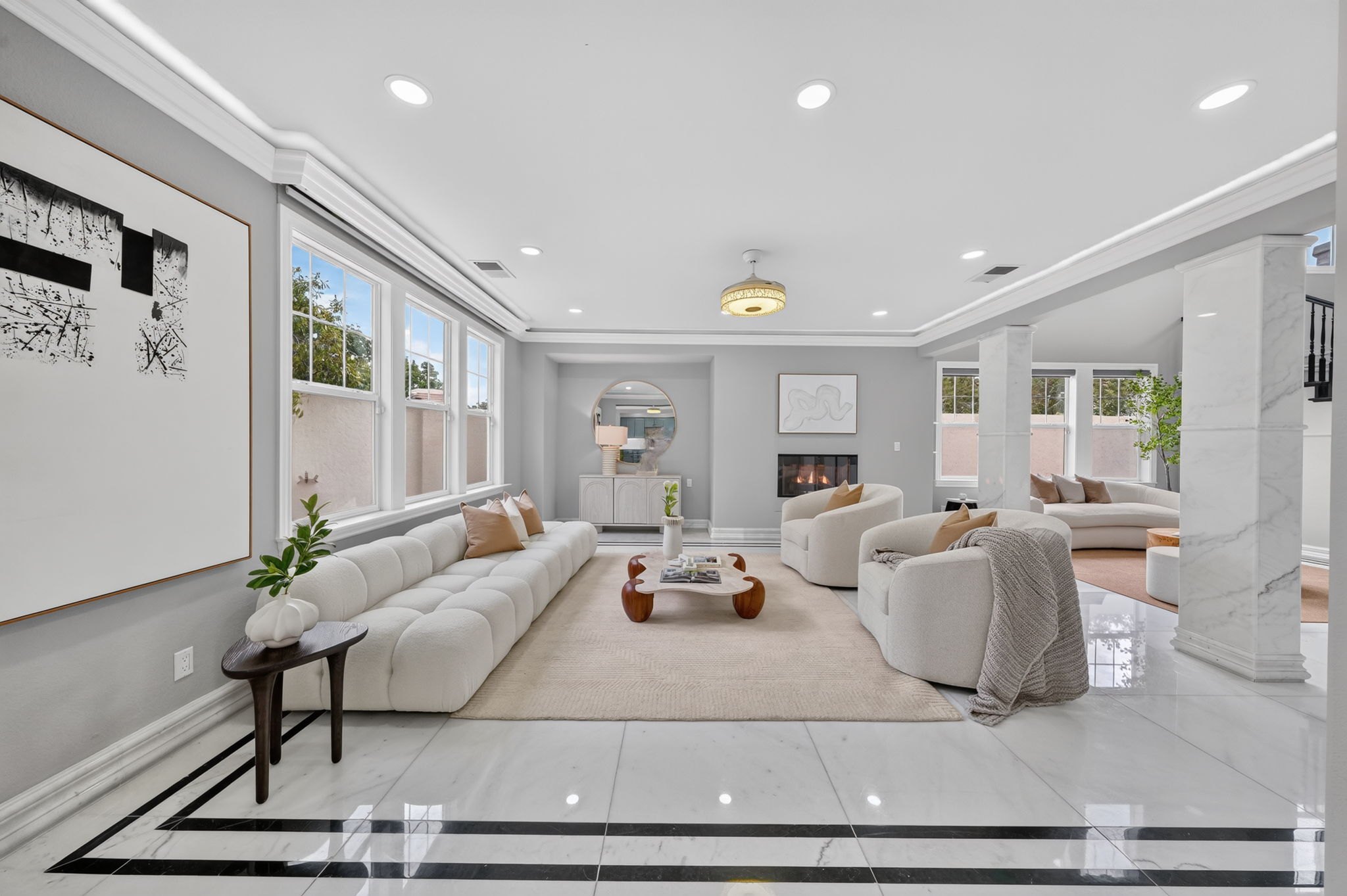
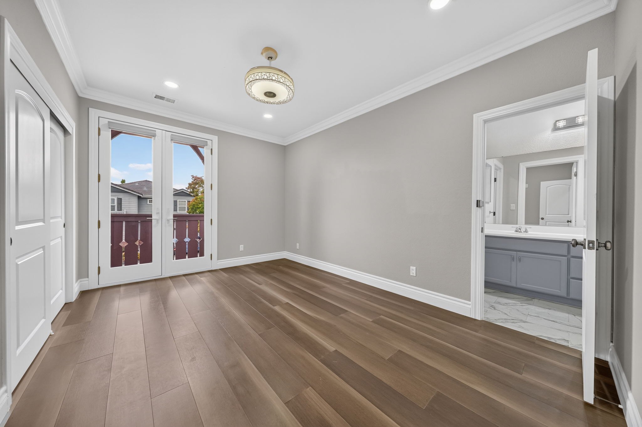
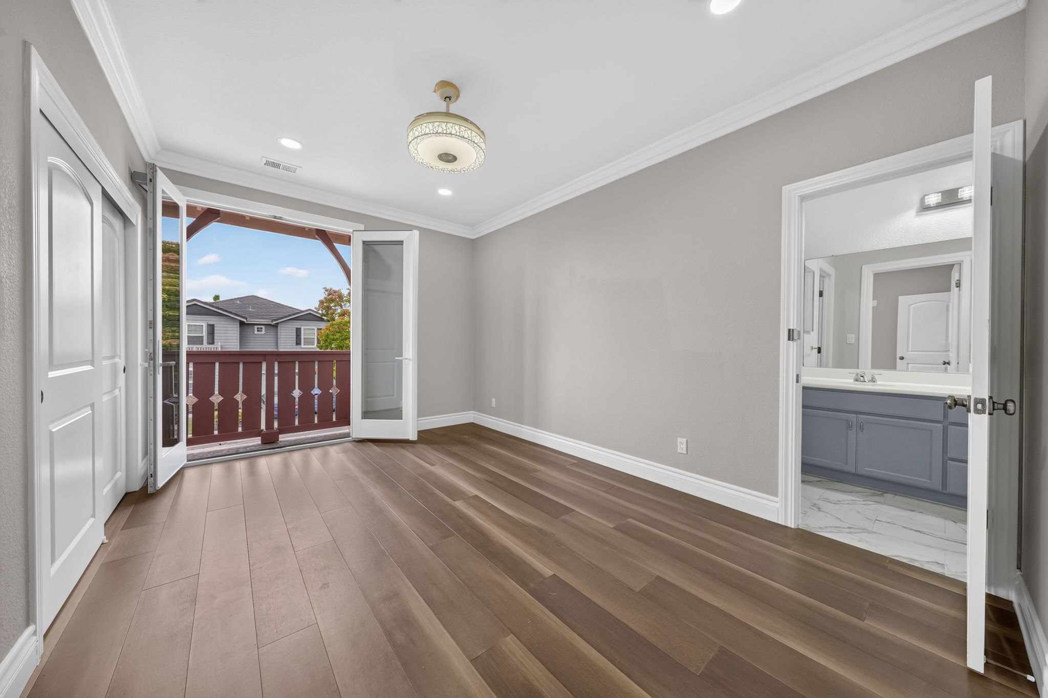
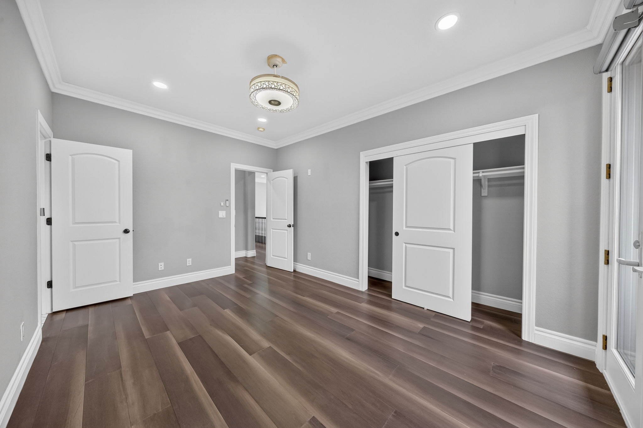
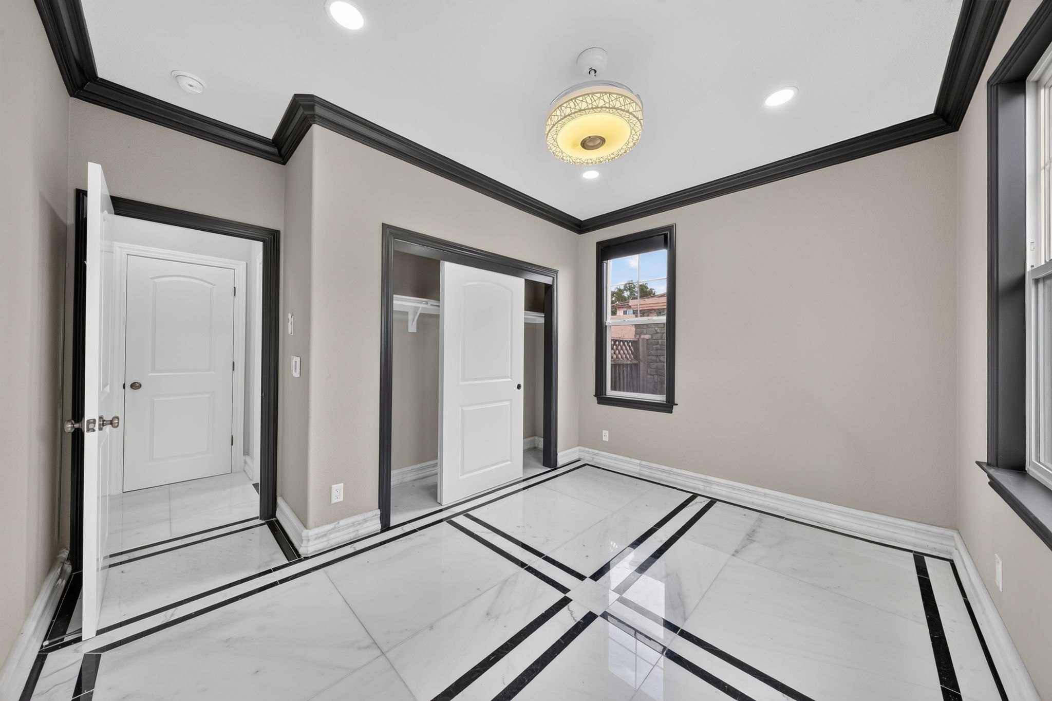
Corner, straight on, corner, straight on. The corners show the layout and the straight on shots are symmetrical, so every angle shows the home in a different way.
If it's a square, go here, there, there, there: all the way around the room.
In the video
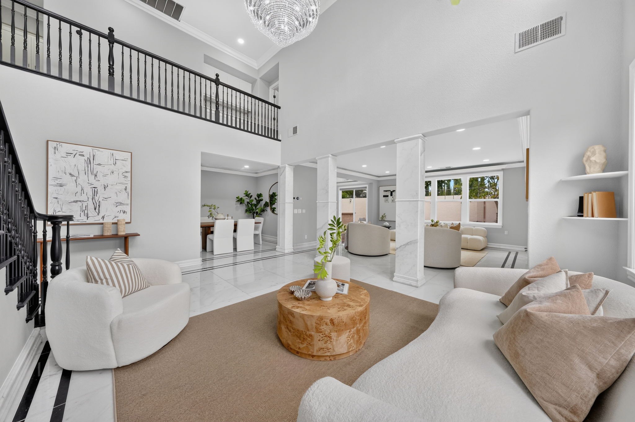
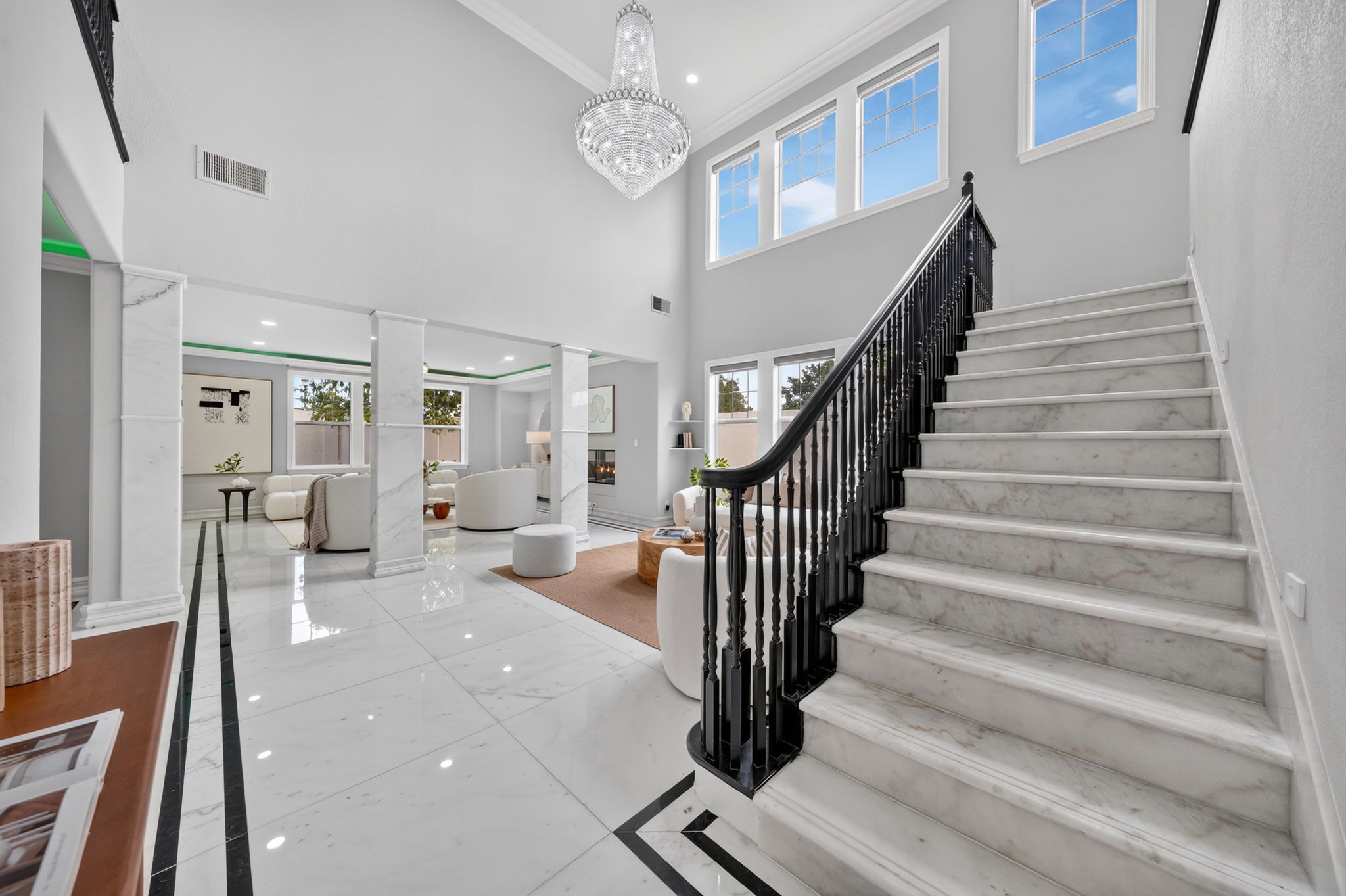
Show the marble stairs, then push in so the chandelier and the open space show more. On the push in I should have turned the camera slightly more to the right.
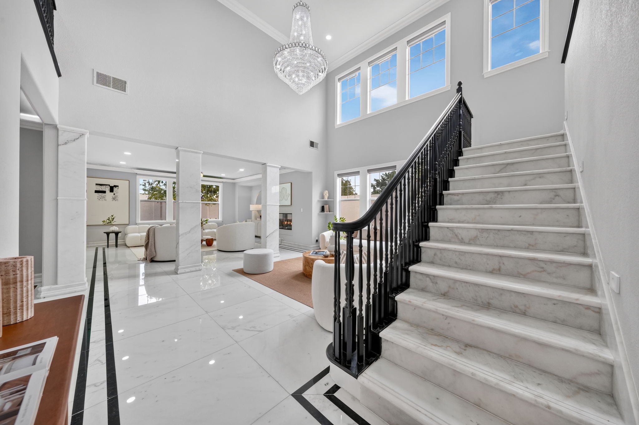
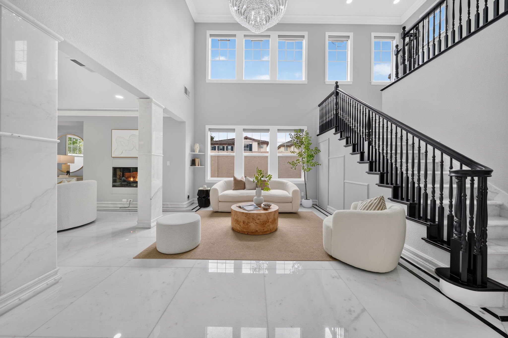
Corner, straight on, corner, straight on, corner. On a somewhat unique home like this one it is not overshooting, because every angle shows the home in a different way.
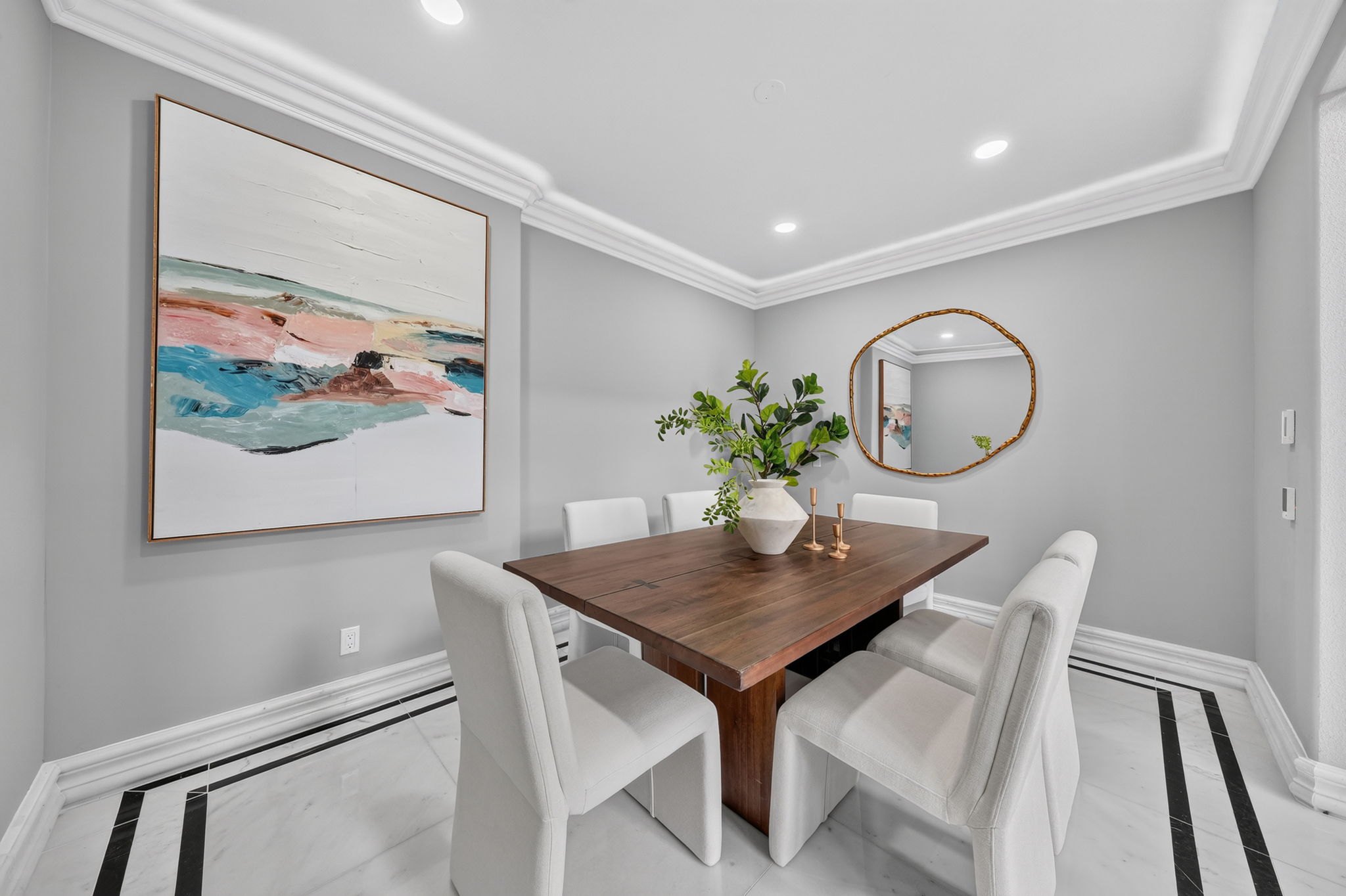
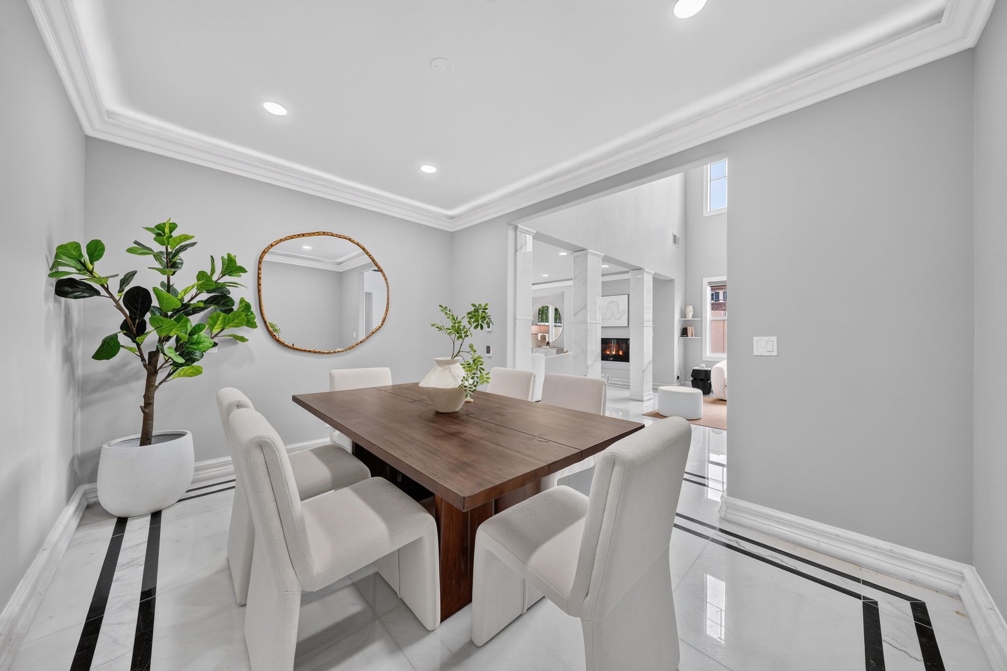
Three shots for the dining area: straight on, a corner and another corner. The room wasn't all that cool, but I still got them.
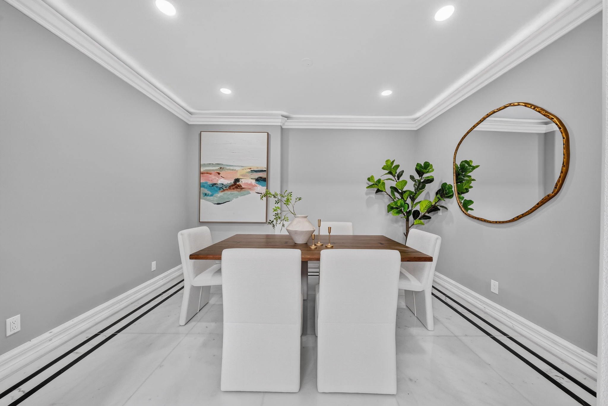
This is something you should really, really take and apply to your future shoots.
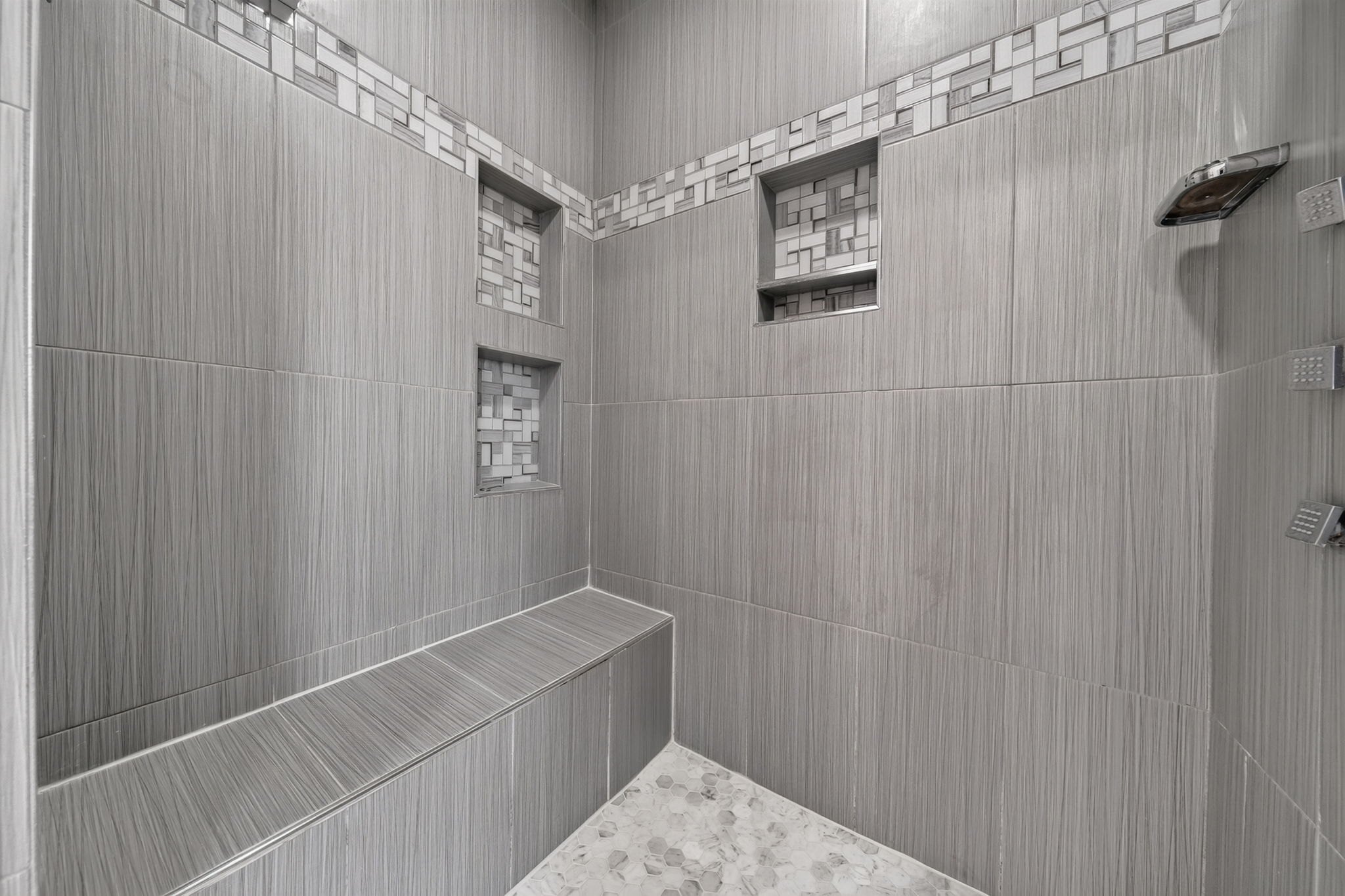
Part 2
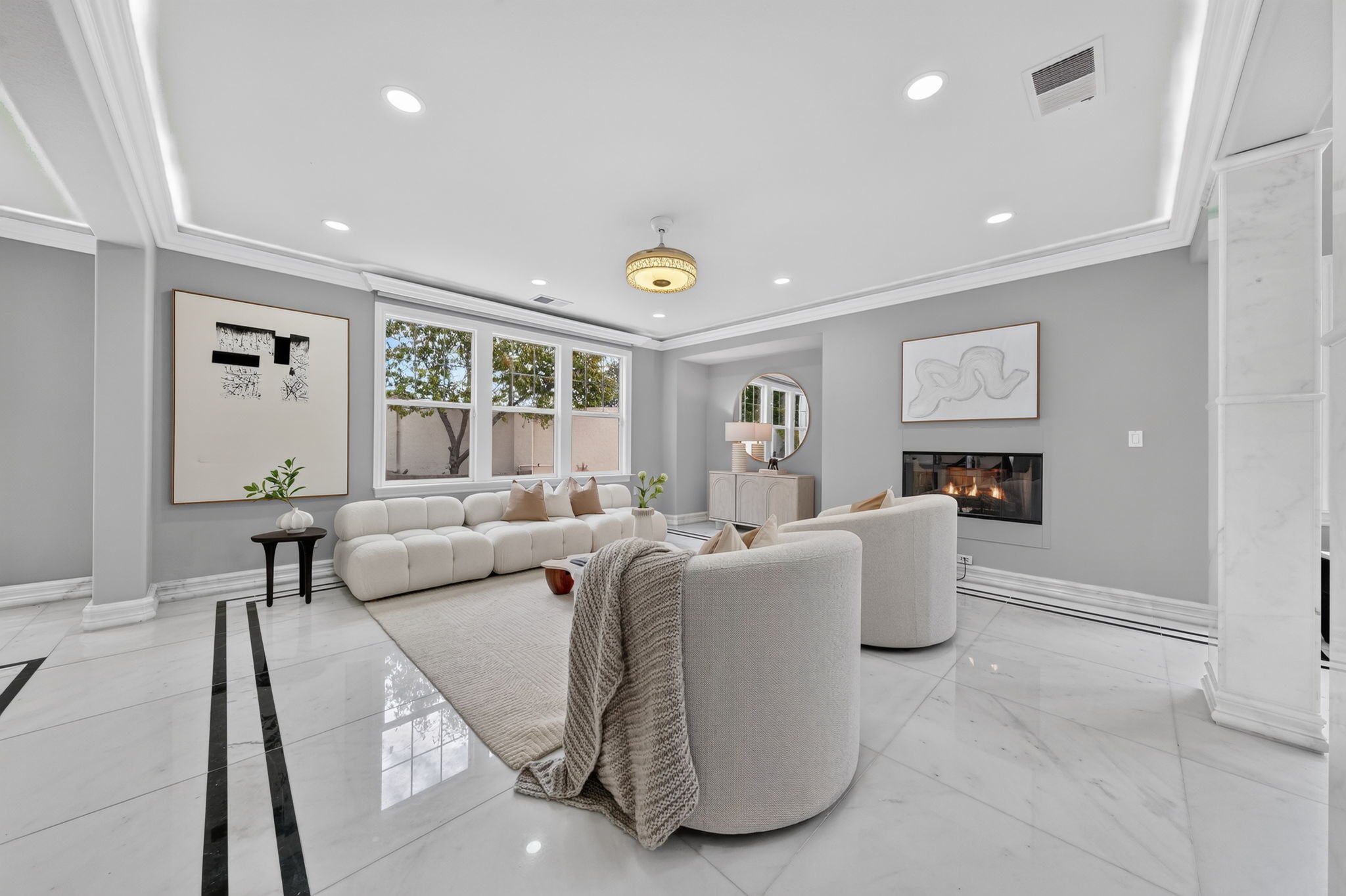
Don't stand fully in the corner when a wall would hide the room behind it. Push in front of that wall so the living area shows.
Fully in the corner: this wall hides the far wall, maybe even the couch
In front of the wall: the living area shows
I am not behind this wall, I am pushing in front of it. Fully in the corner, this wall would hide the far wall, maybe even the couch. I want to show the living area as much as I can.
Part 3
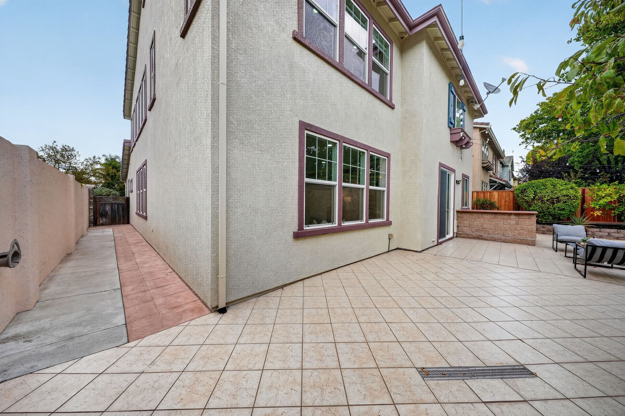
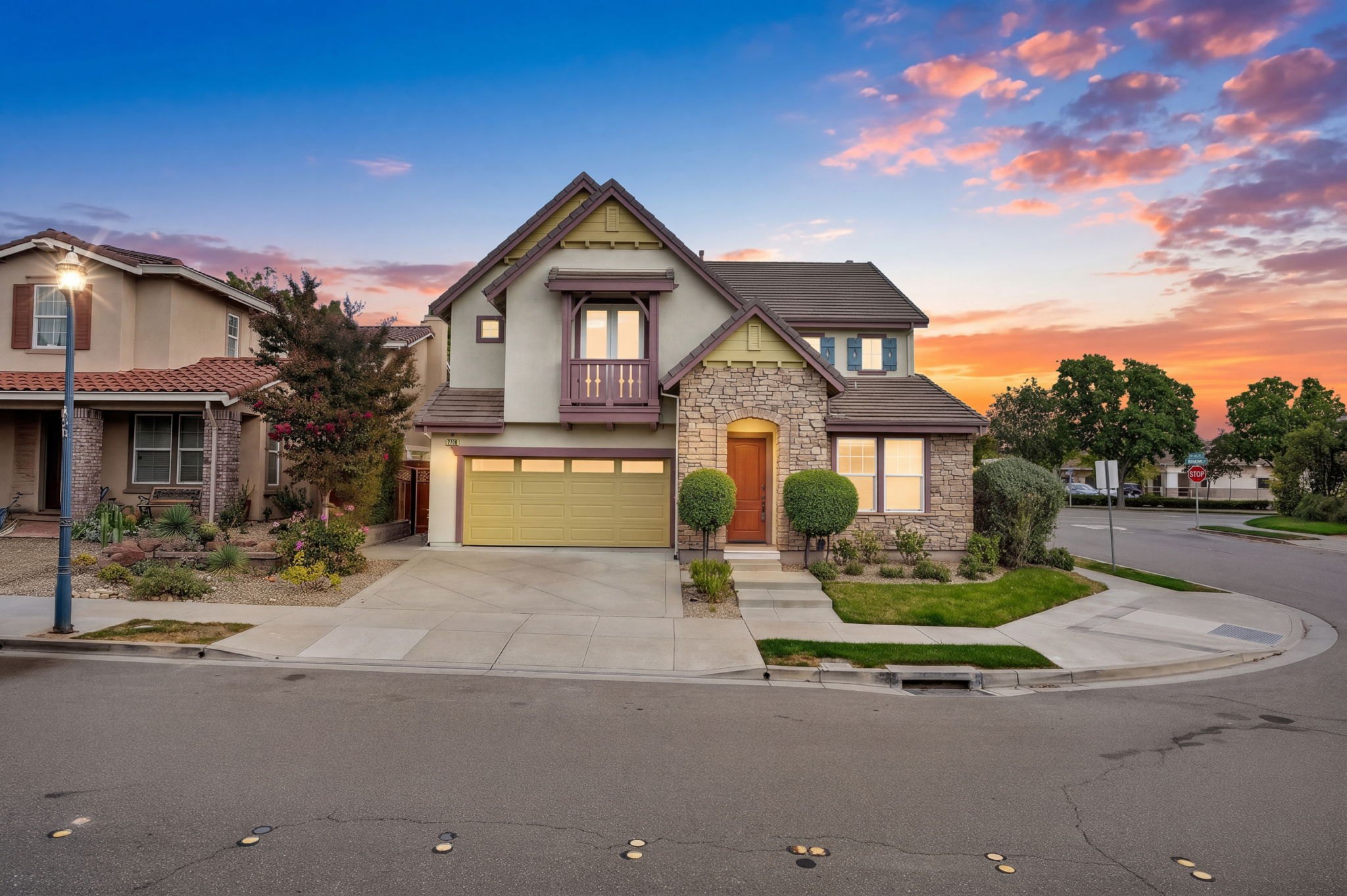
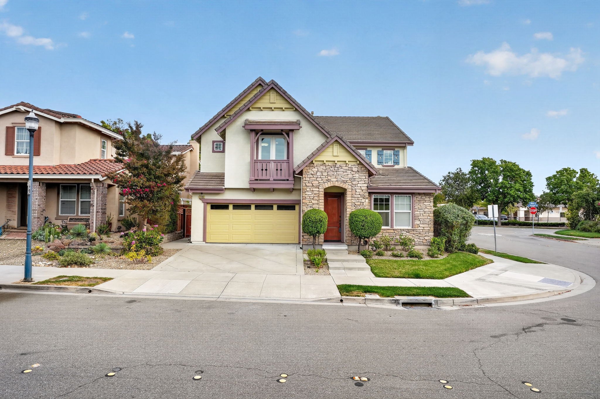
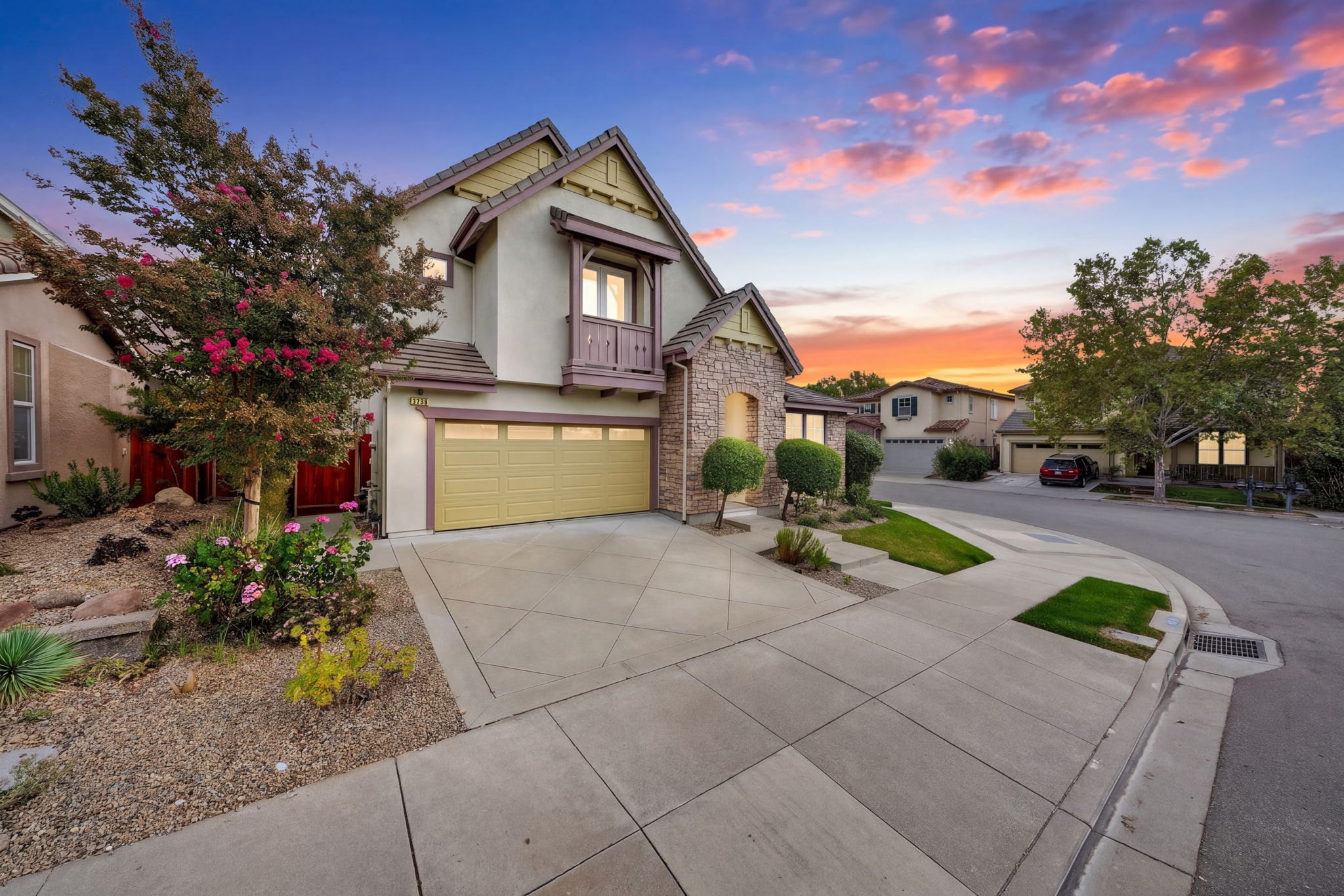
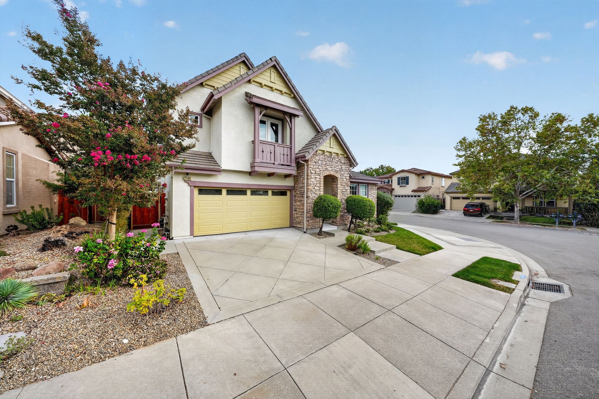
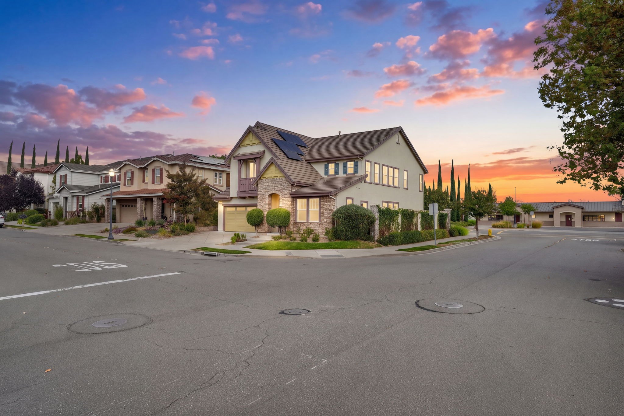
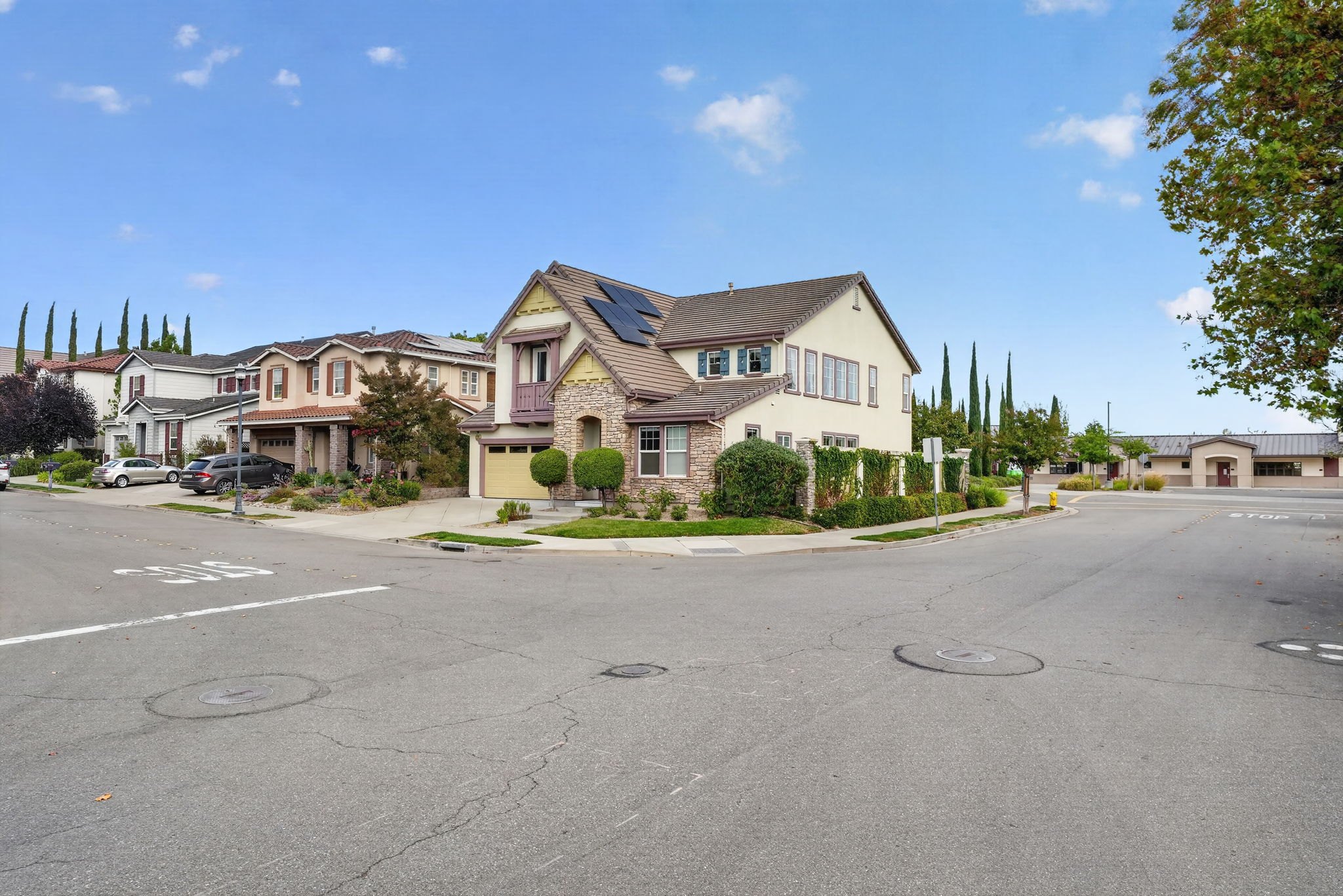
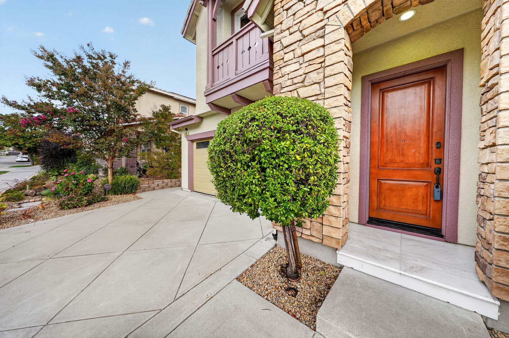
Raise the camera as high as you possibly can on every front exterior, even at an angle. Here it is roughly 10 feet up.
Tippy toes if you have to.
The straight on shot, with the camera raised to roughly 10 feet. The twilight is a virtual twilight.
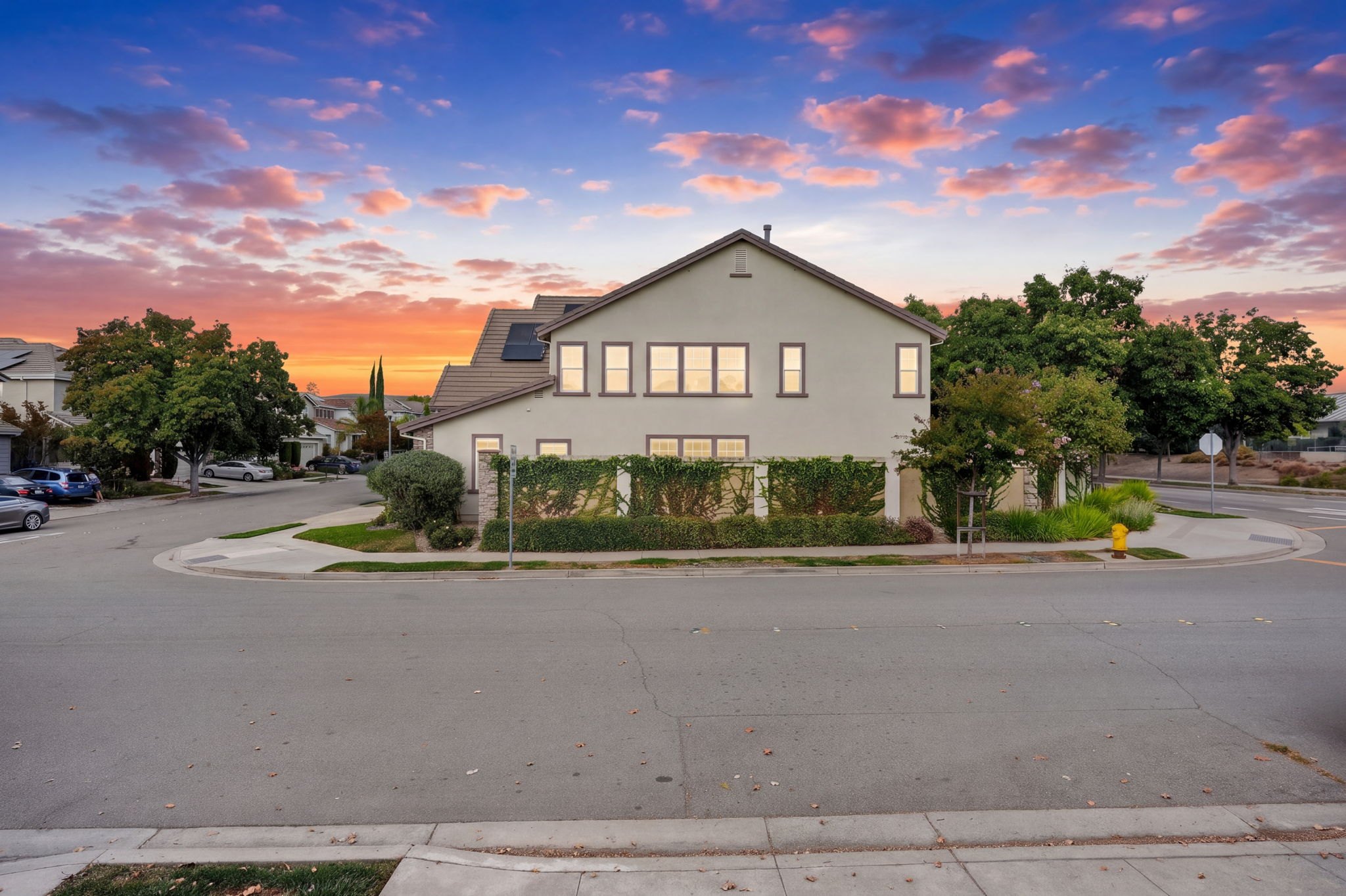
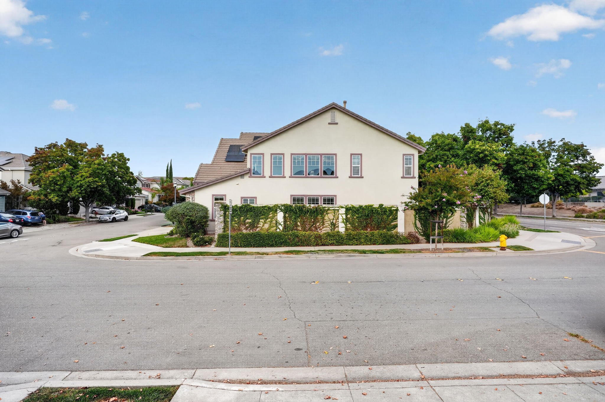
Even at an angle I still raise the camera. You probably get this shot too, just a bit lower. Go as high as you possibly can, tippy toes if you have to.
Shot on a 24 mm. On a corner lot it looked better than a wide angle.
The edge of the other street shows here. You don't need to highlight it, but it shows where the street starts and where it ends.
Part 4
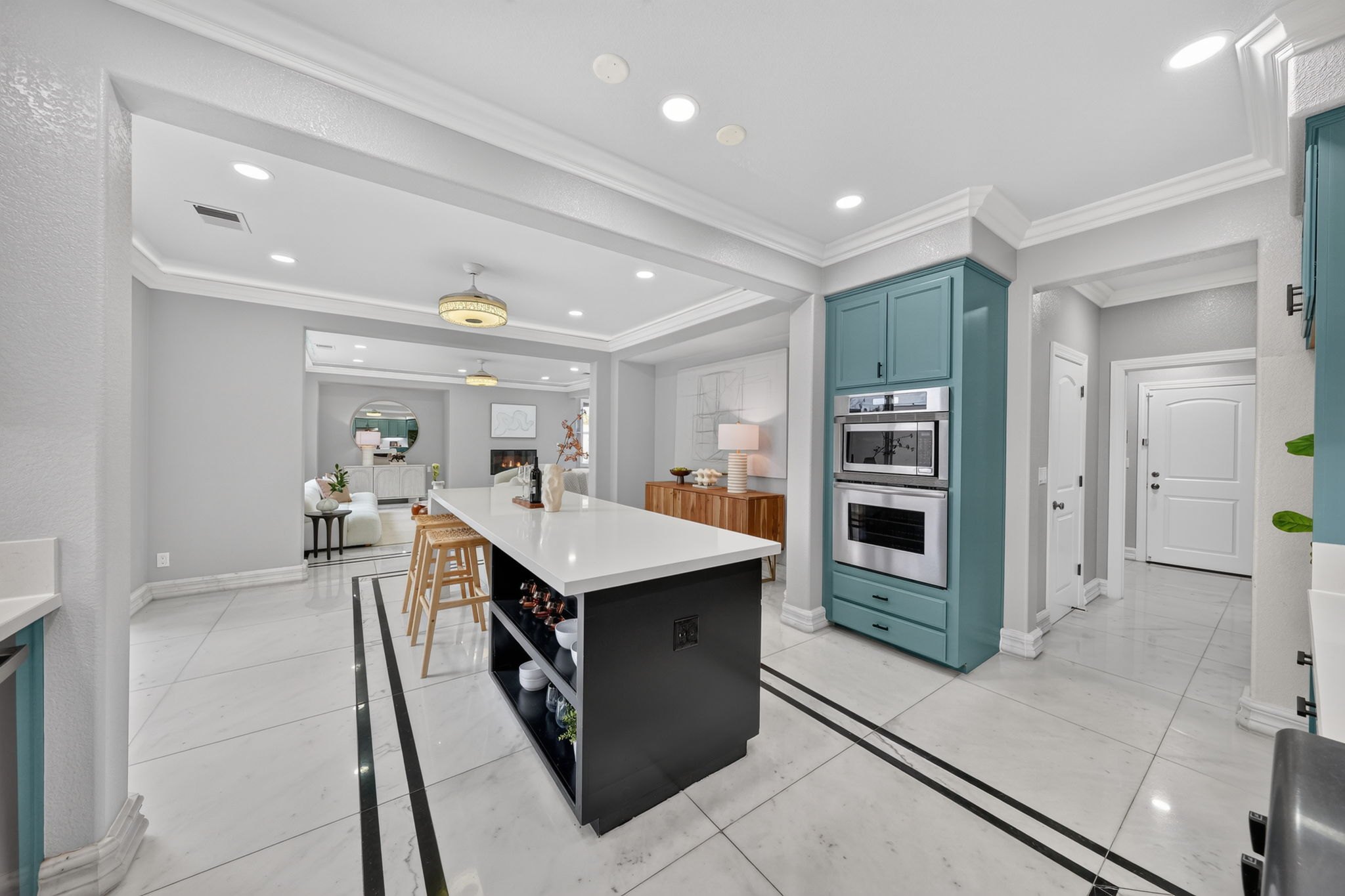
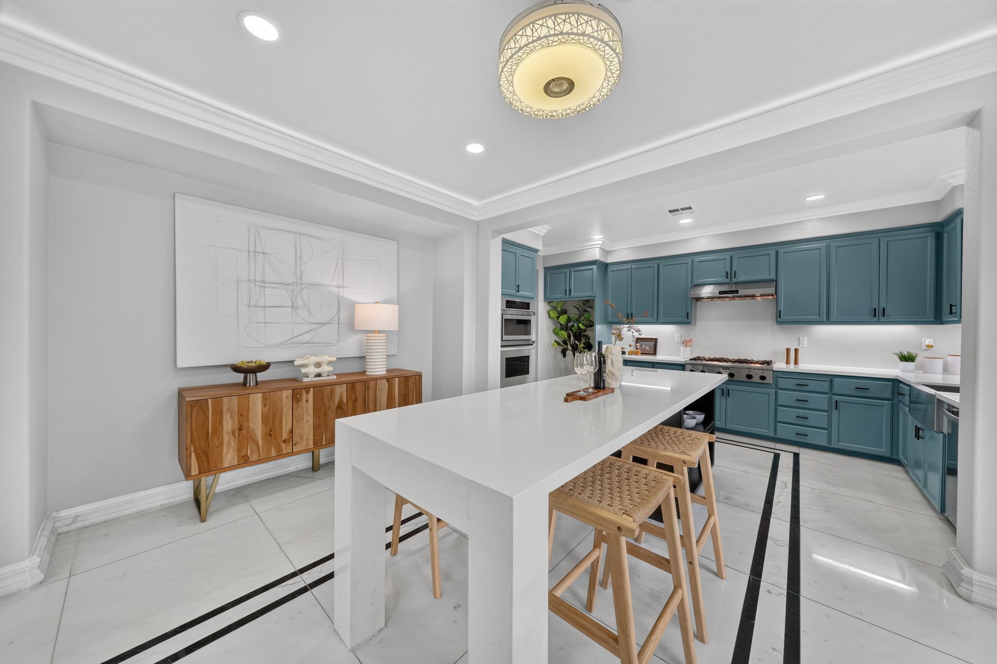
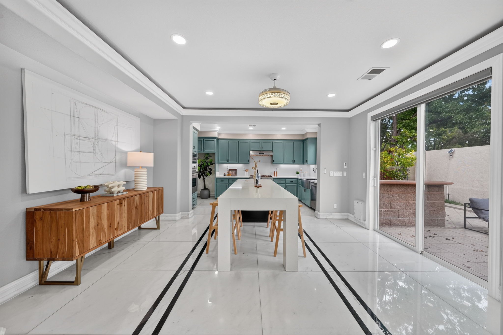
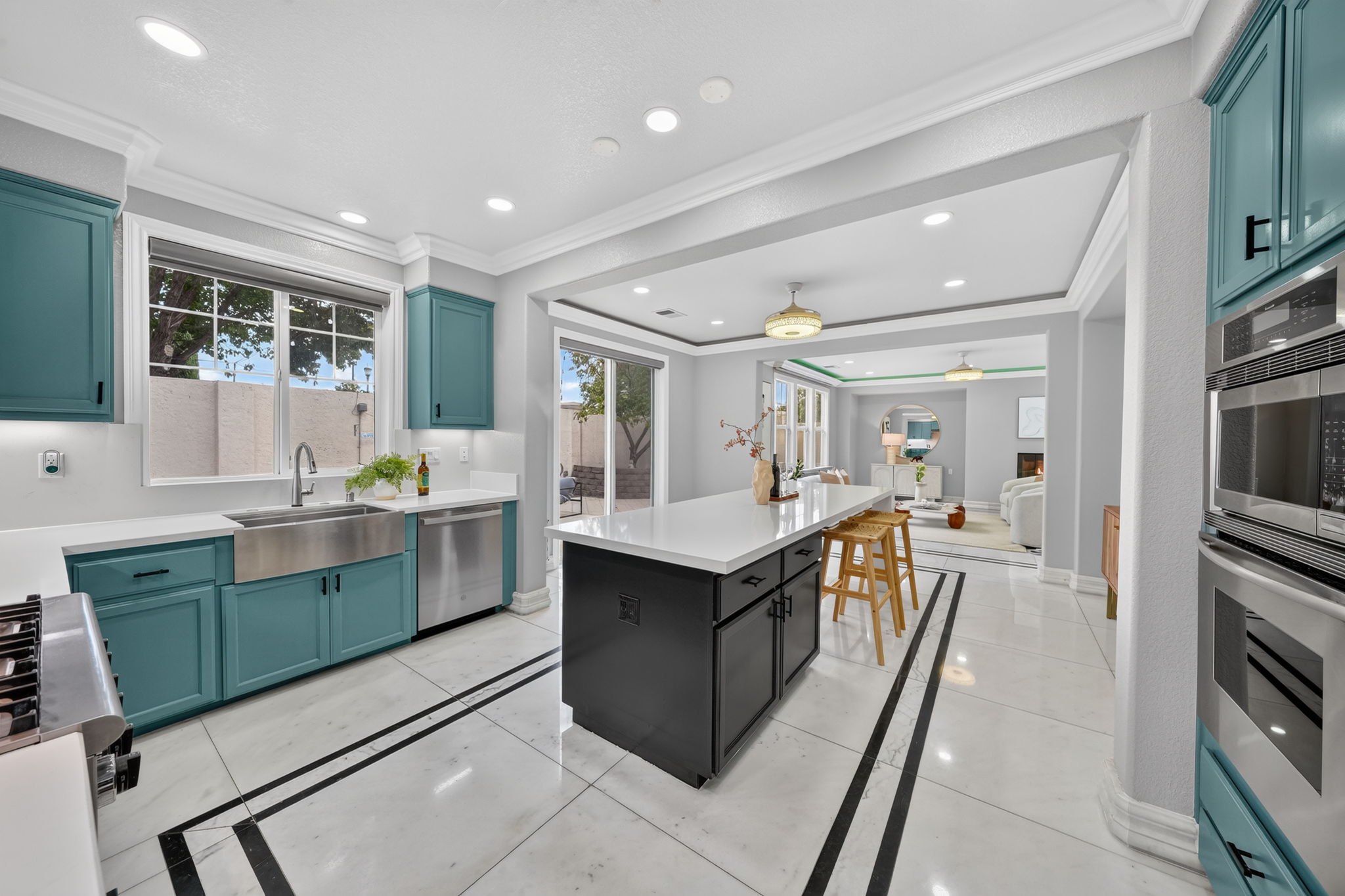
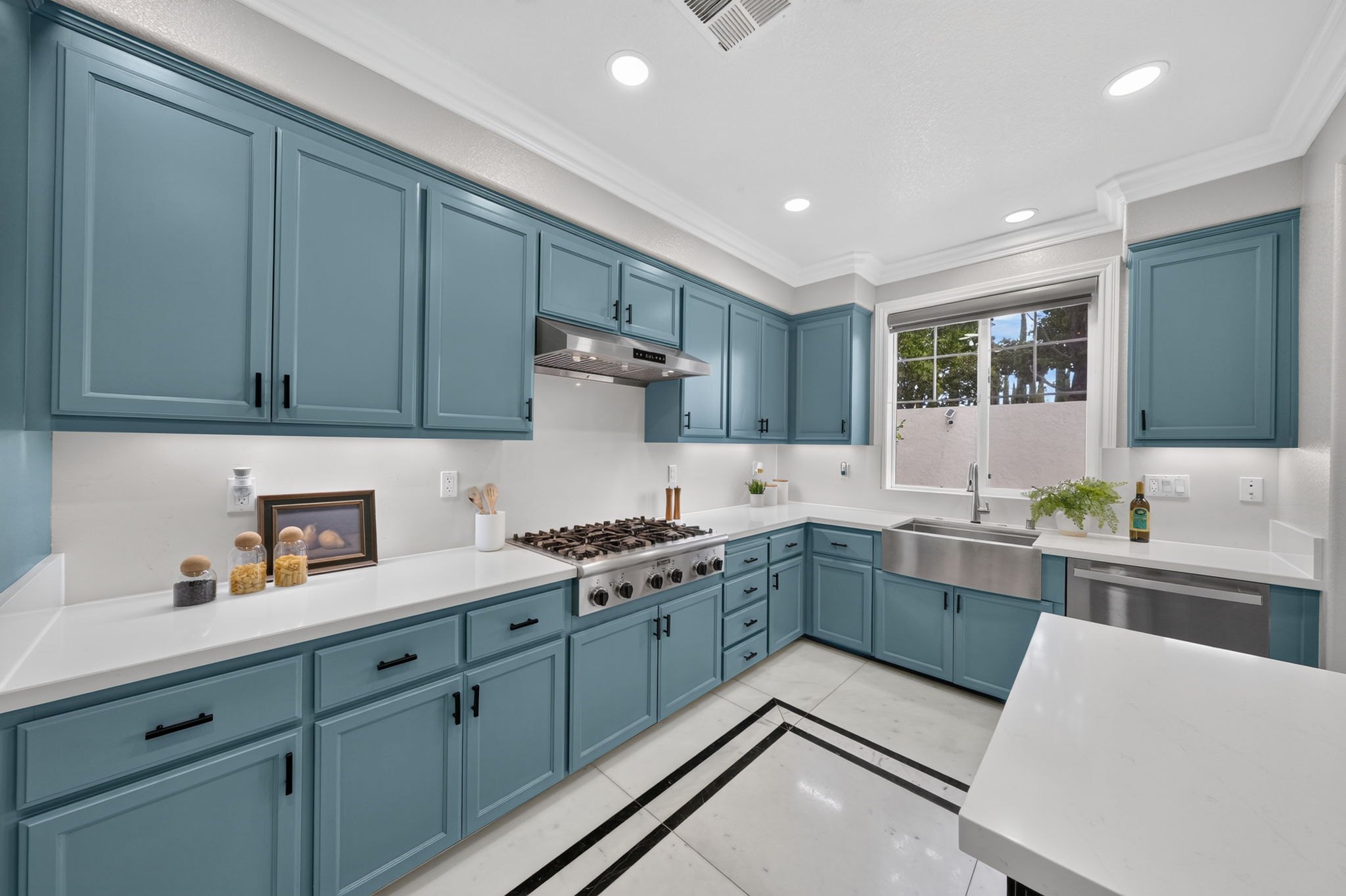
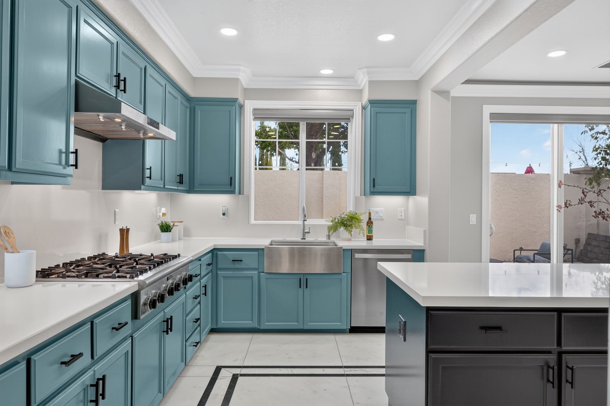
Take note of the cabinet height and stay locked into it all throughout the kitchen. Don't chop windows in half; save them as much as you possibly can.
Cabinet height, locked in all throughout the kitchen
A window chopped in half by the edge of the frame
The whole window saved inside the frame
From this corner the island looks long. From further back it gets warped, the island looks tiny and the kitchen sits too far back, so I might delete it. At least nothing is chopped, not even the windows.
A standard angle: a sliver of countertop on the edge and the camera at cabinet height. I wish I could have backed up more, but it was a squeeze.
Part 5
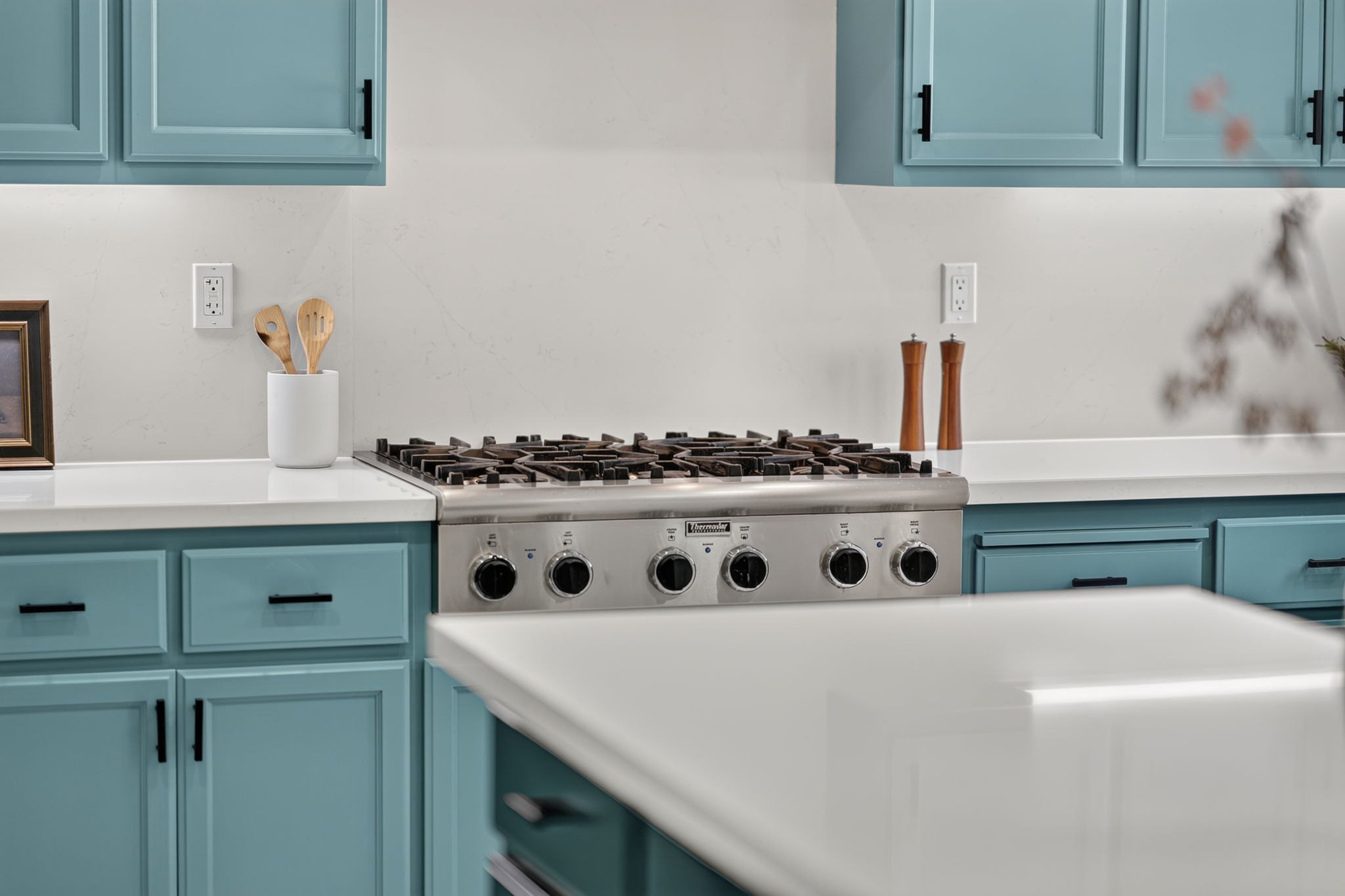
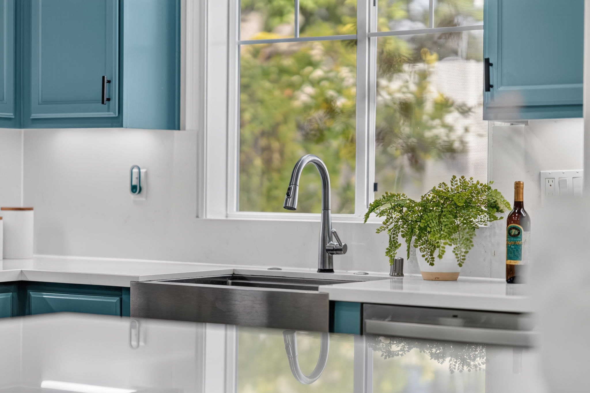
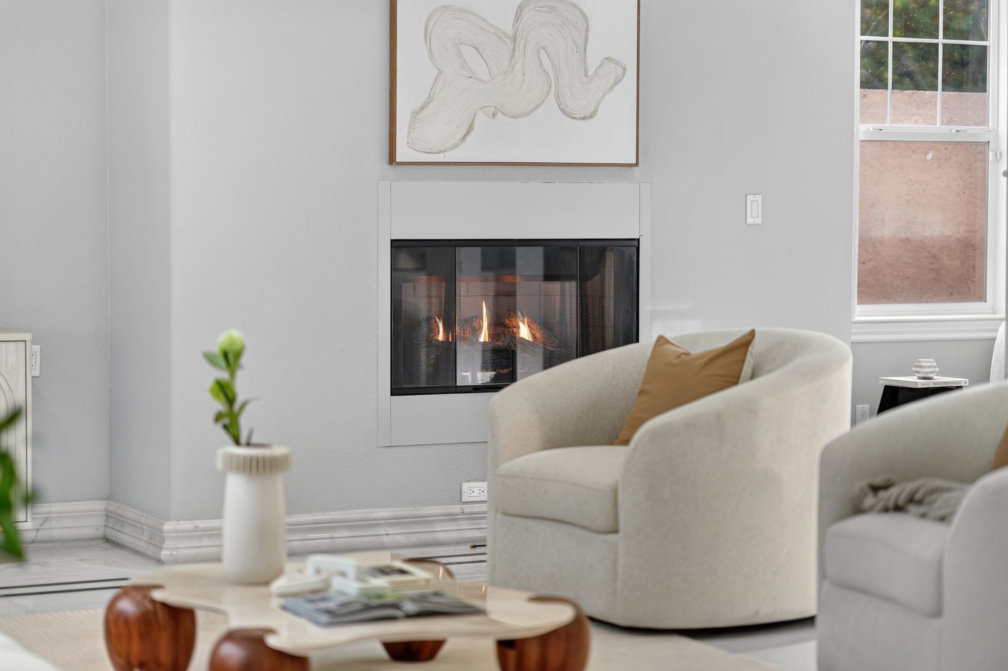
Center a close up on the rule of thirds grid so the subject almost fills the center square.
A close up: the subject almost fills the center square
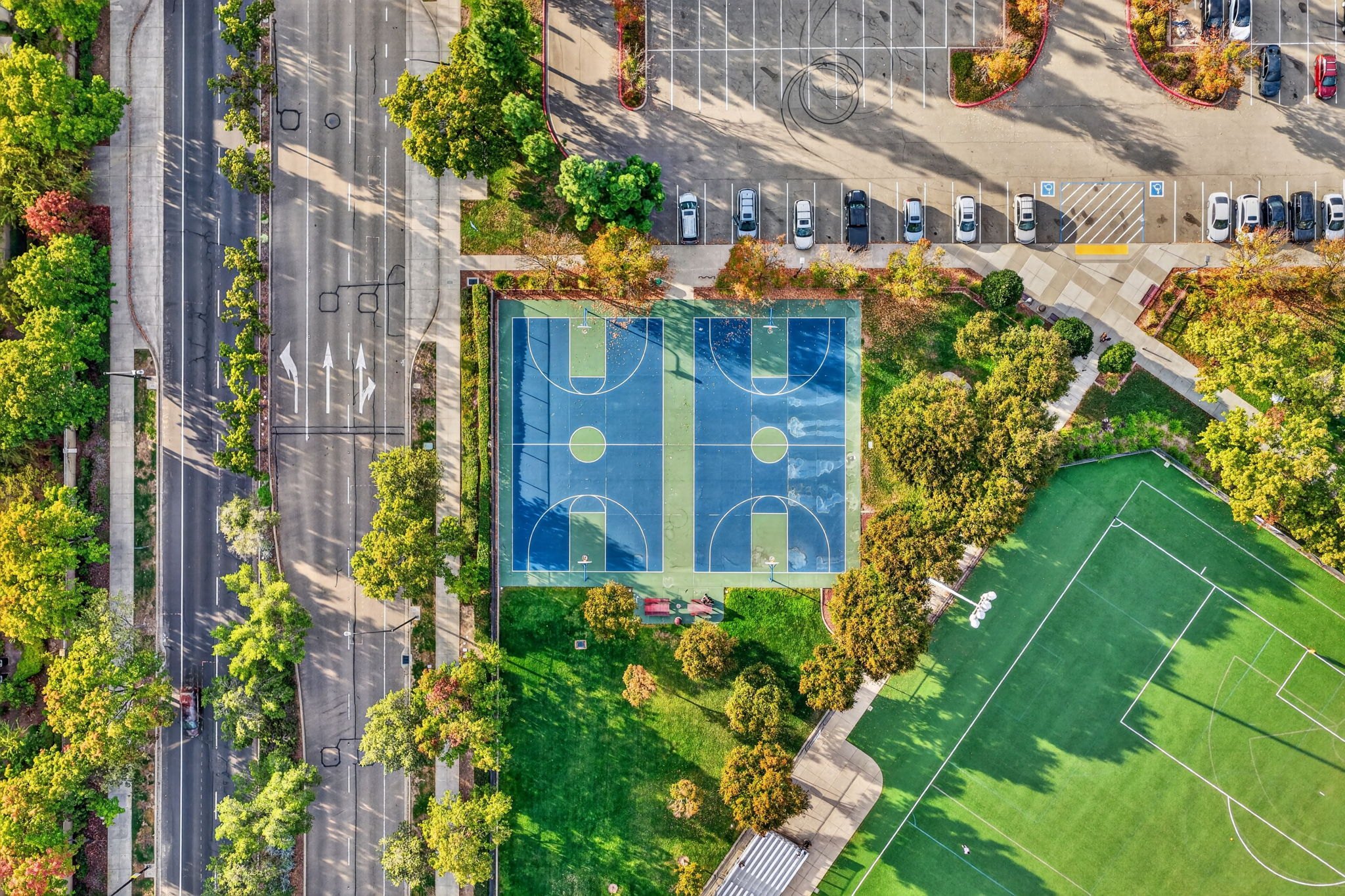
A top down: the courts sit in the center square
Put the grid on this one and the range sits right in the center, almost filling the center square. It just goes a bit beyond.
Same thing here, in the center. I like to focus right where the water comes out.
A close up of the fireplace. Nothing fancy, but that is real fire, and that almost never happens.
Part 6
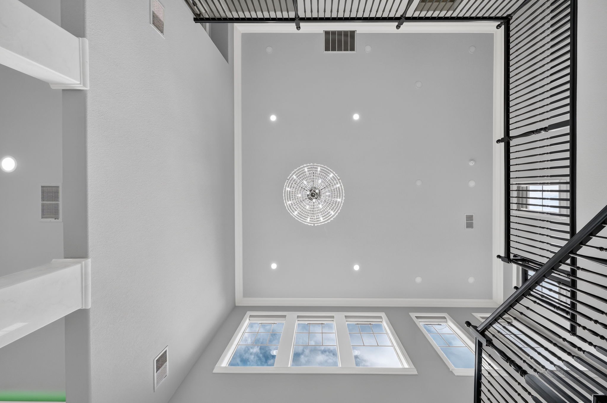
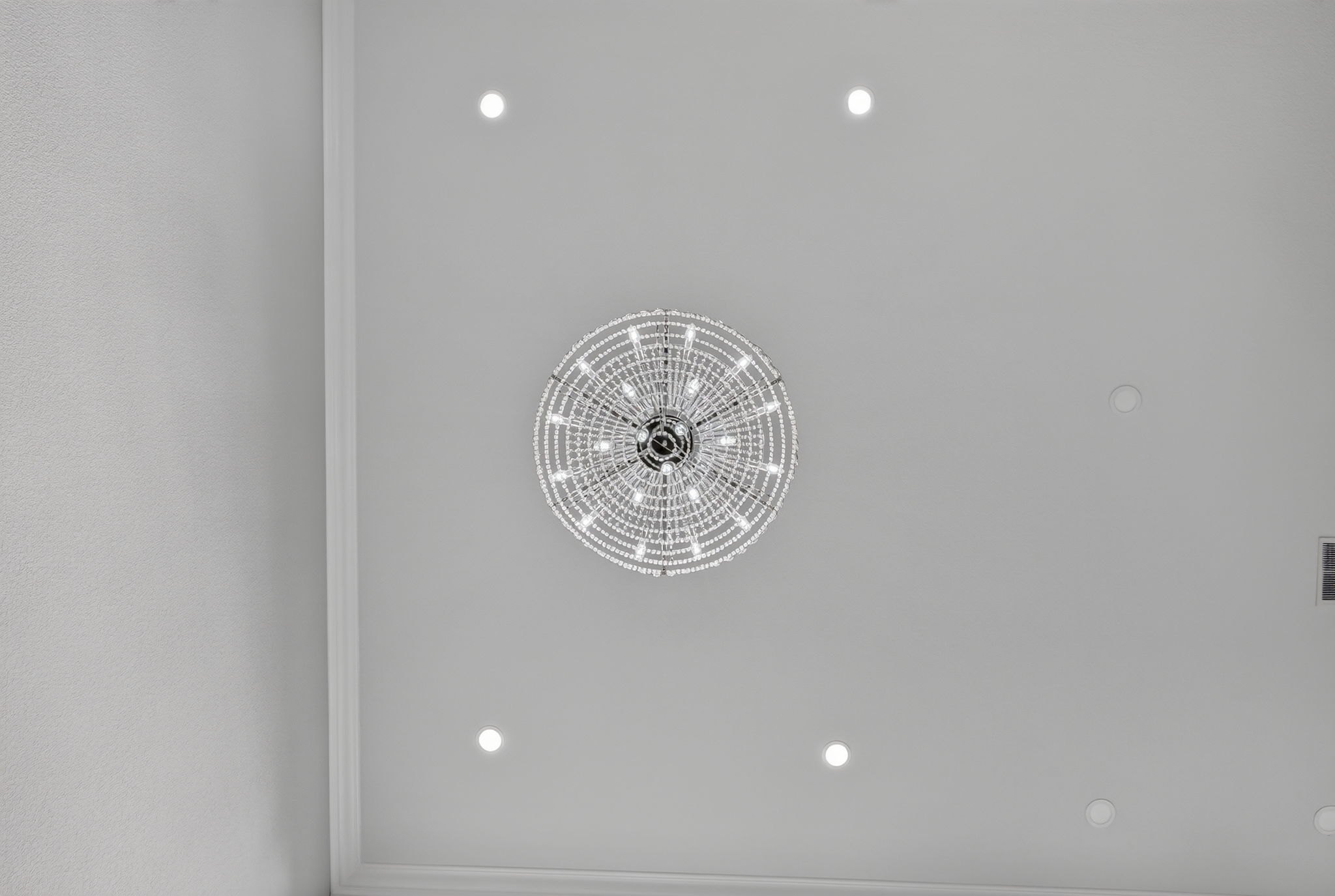
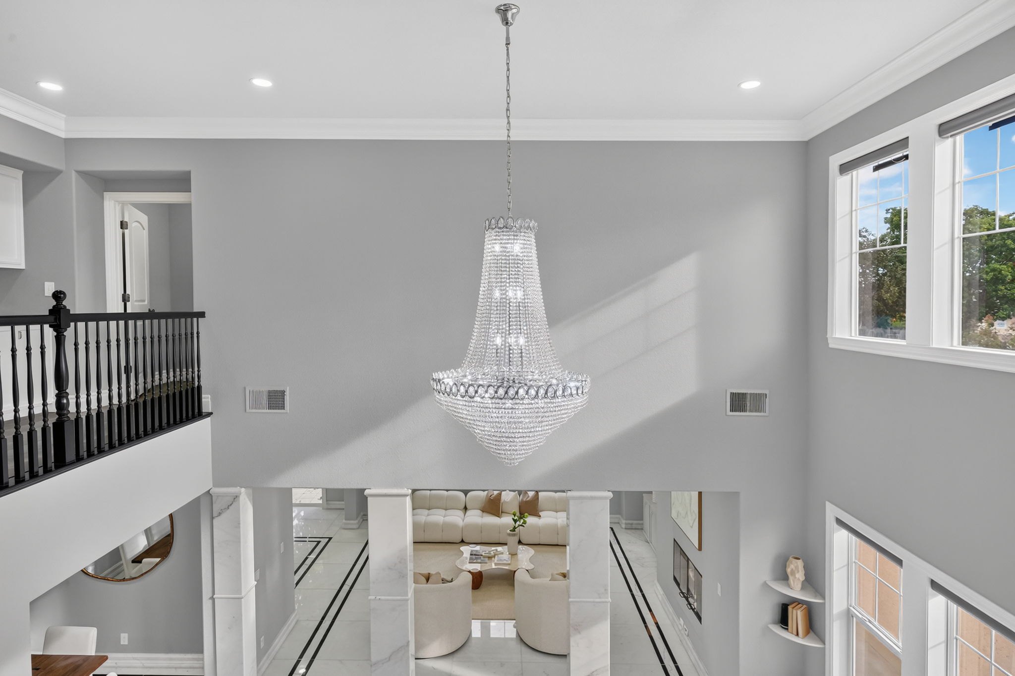
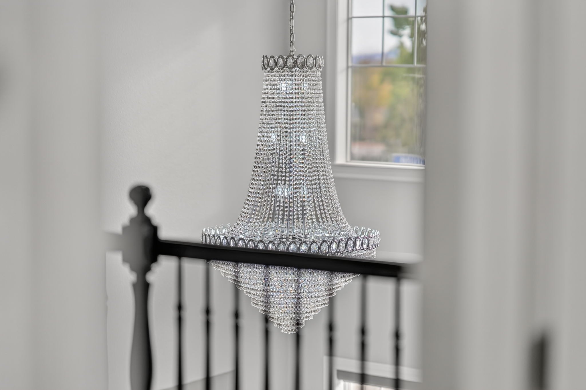
If a home has a nice chandelier, always get a shot from right under it, looking straight up.
Stand right under it and look straight up.
A 12 mm for the far one, then a 20 or 24 for the close up.
Part 7
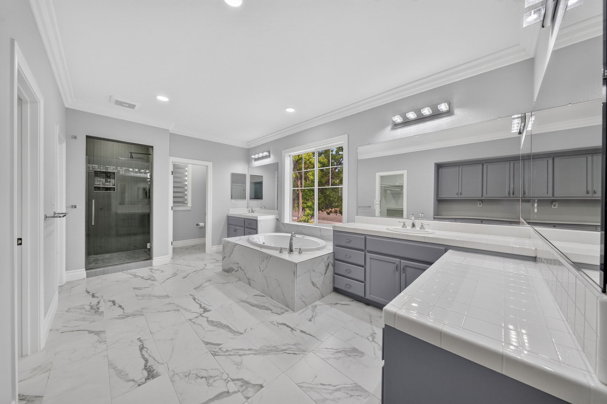
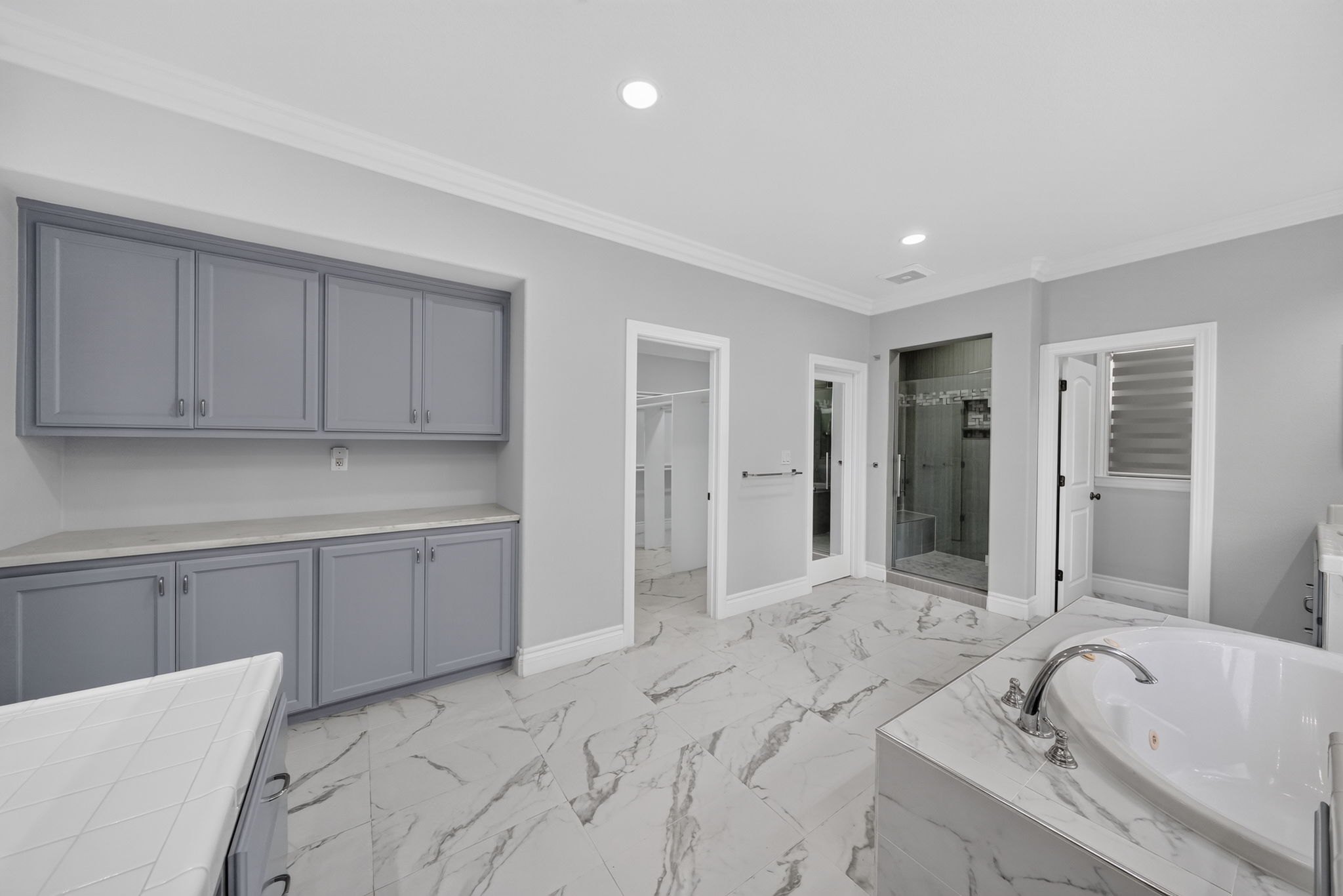
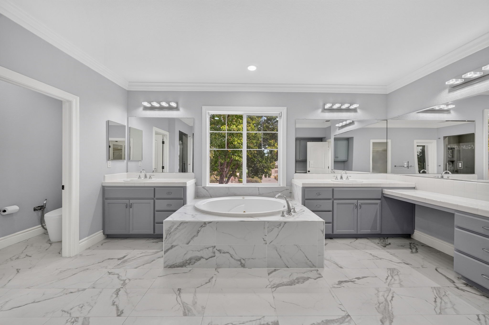
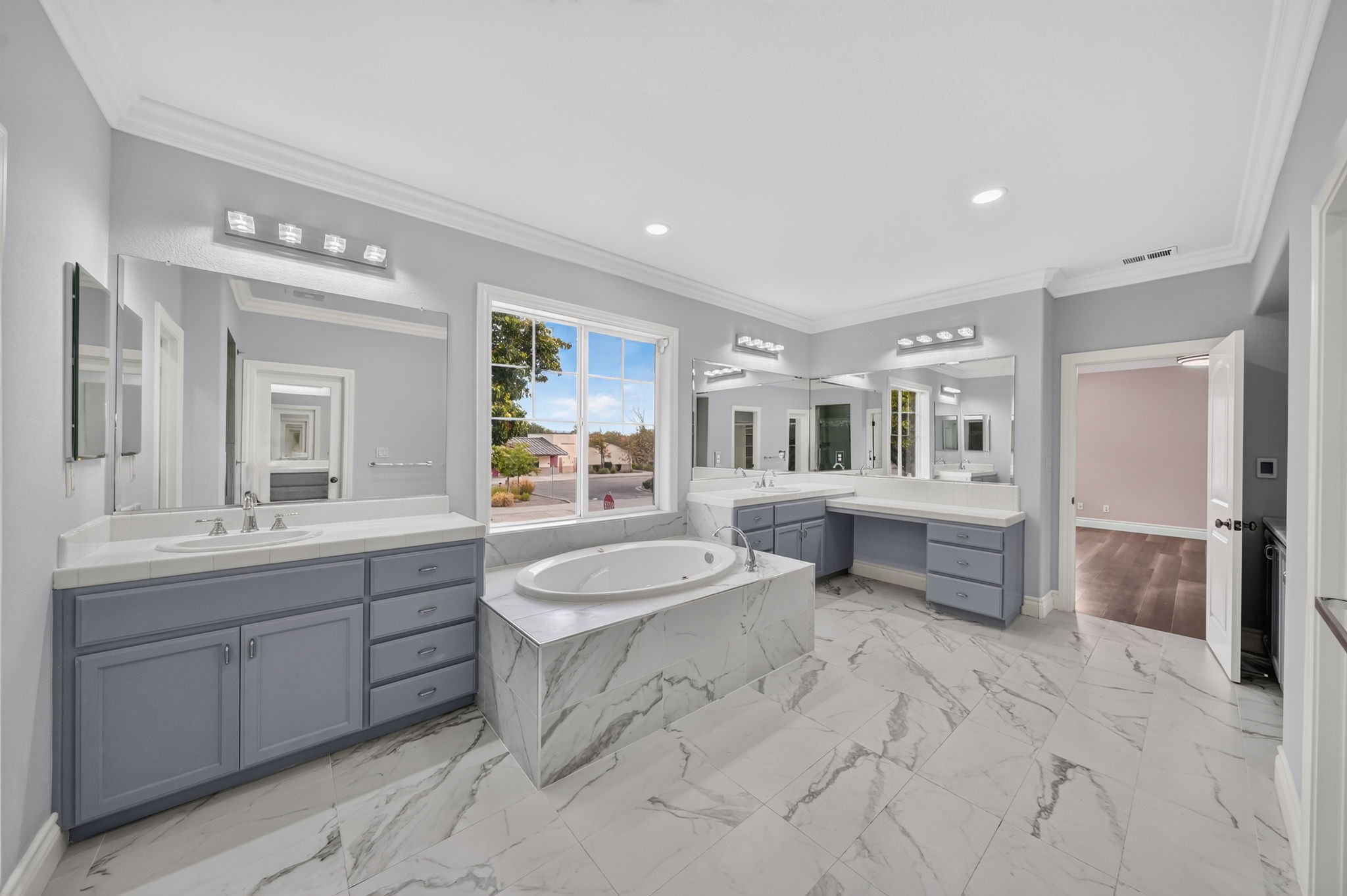
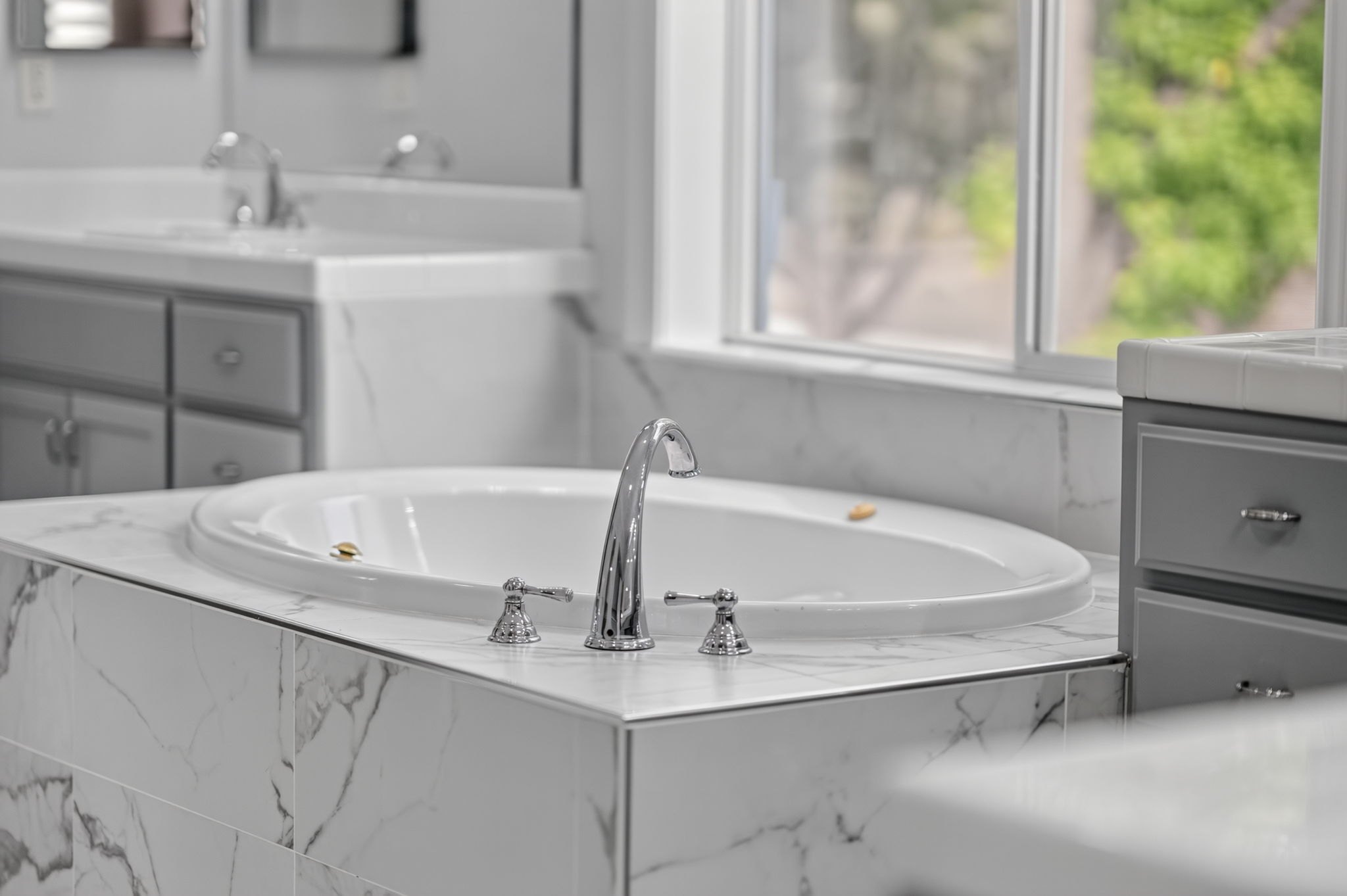
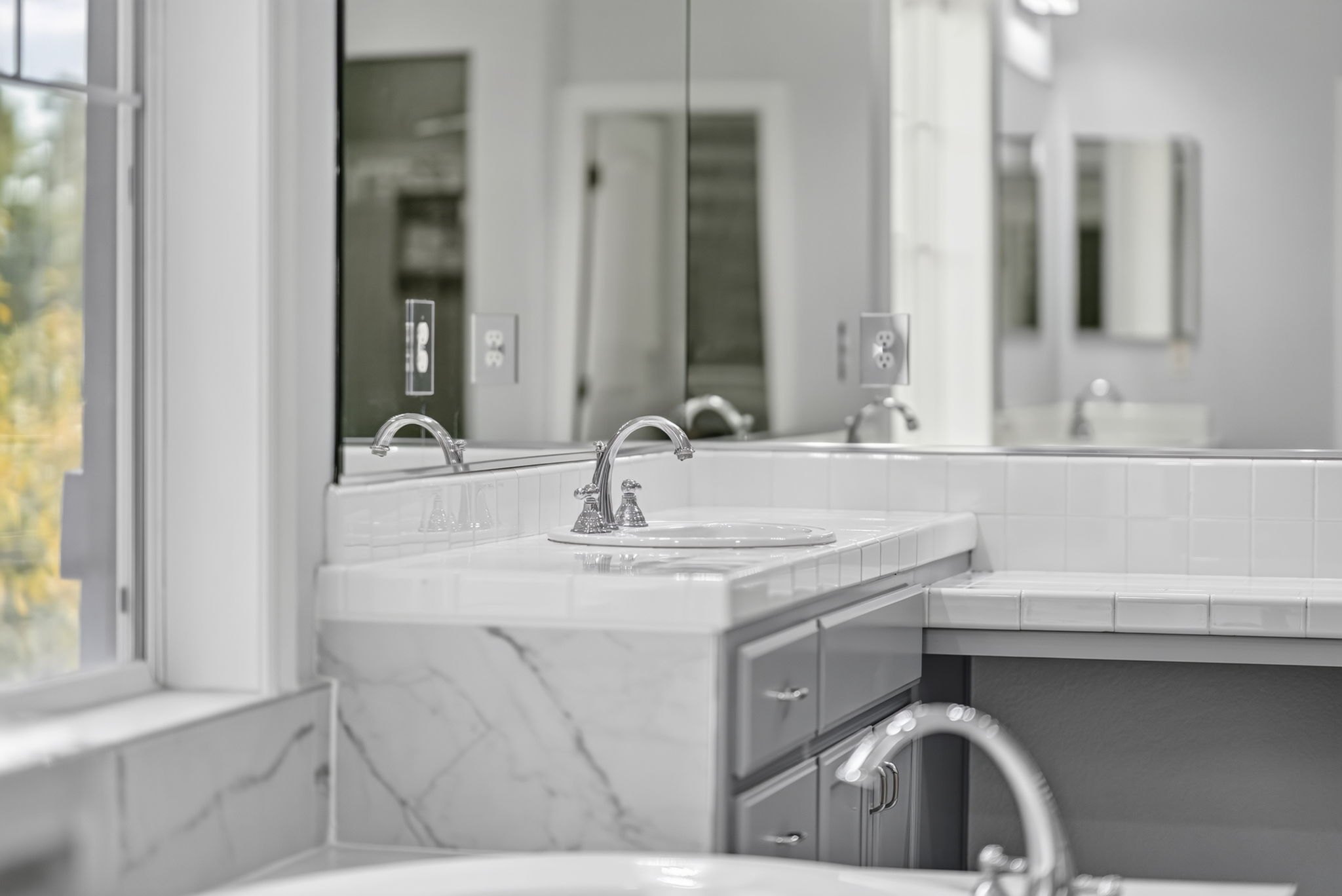
When the primary bathroom is big, with double sinks, the shower and the tub, treat it like a kitchen: every angle different.
Little micro moves: shoot, push in a bit, then a little to the side
Every angle different: corner, straight on, corner, all the way around
In the video
Part 8
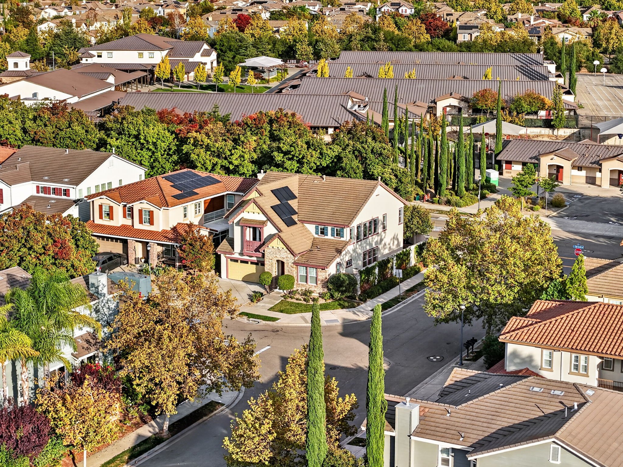
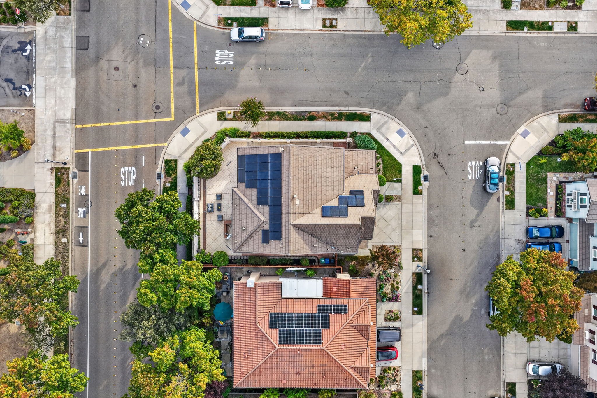
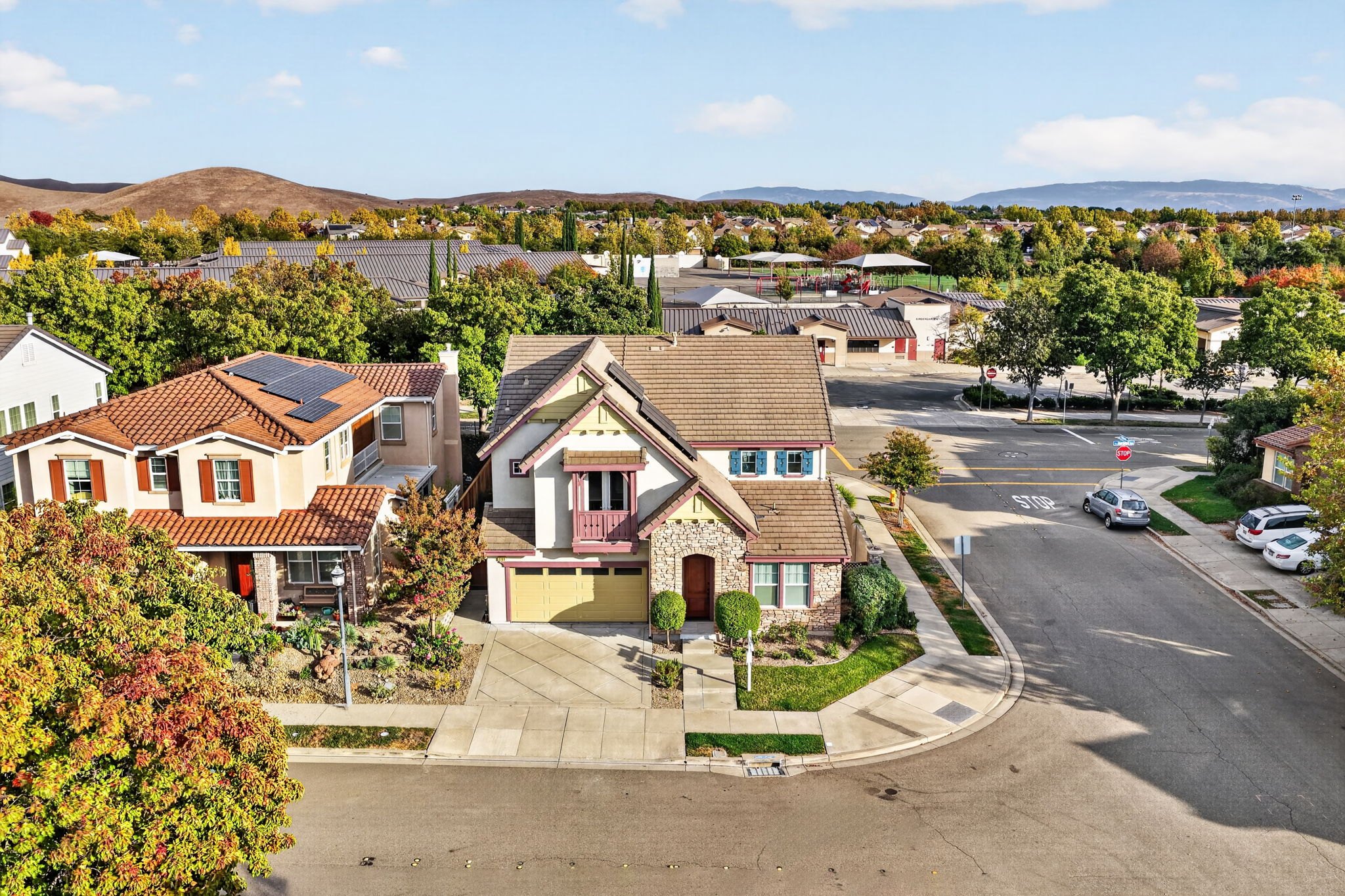
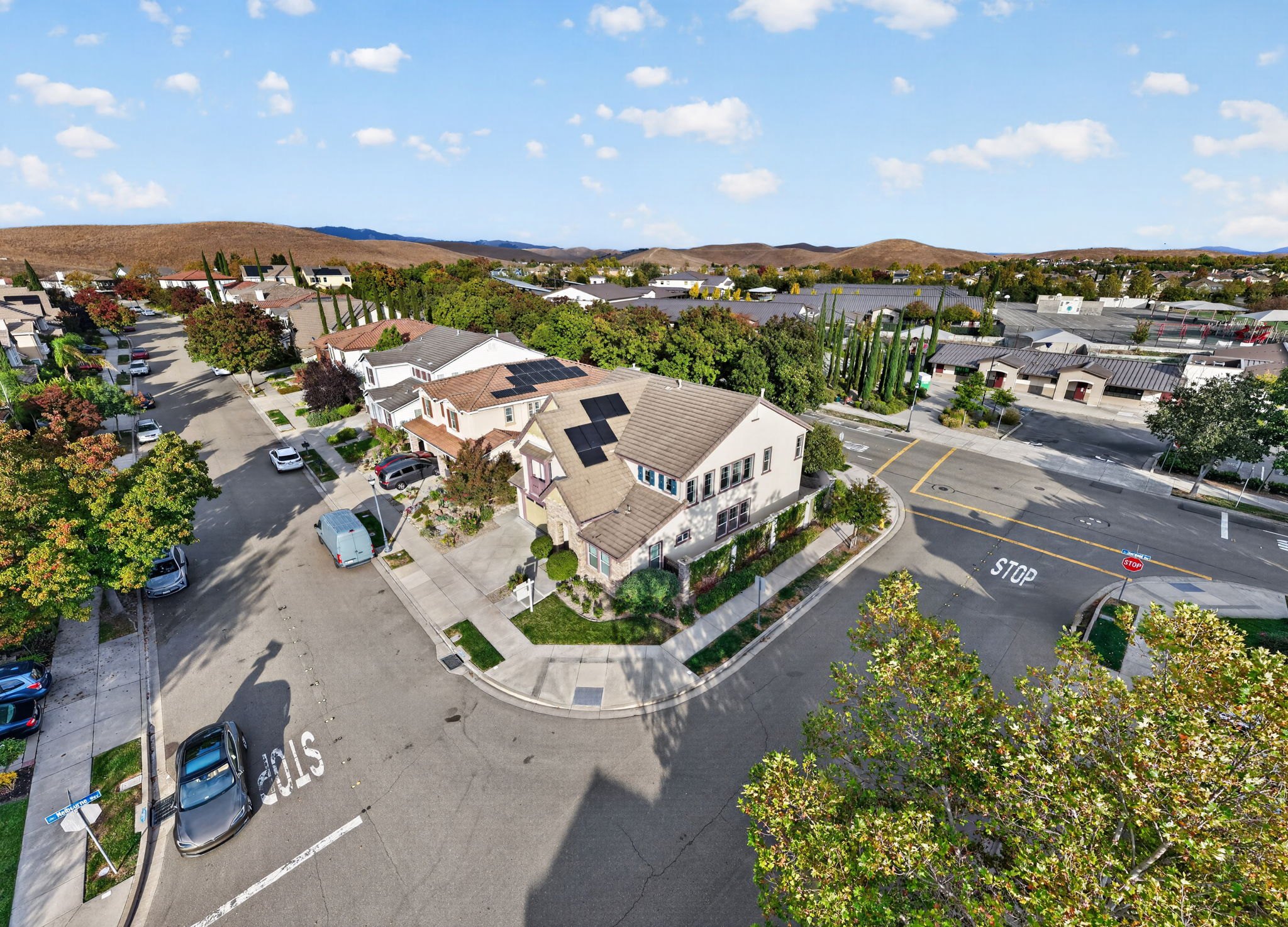
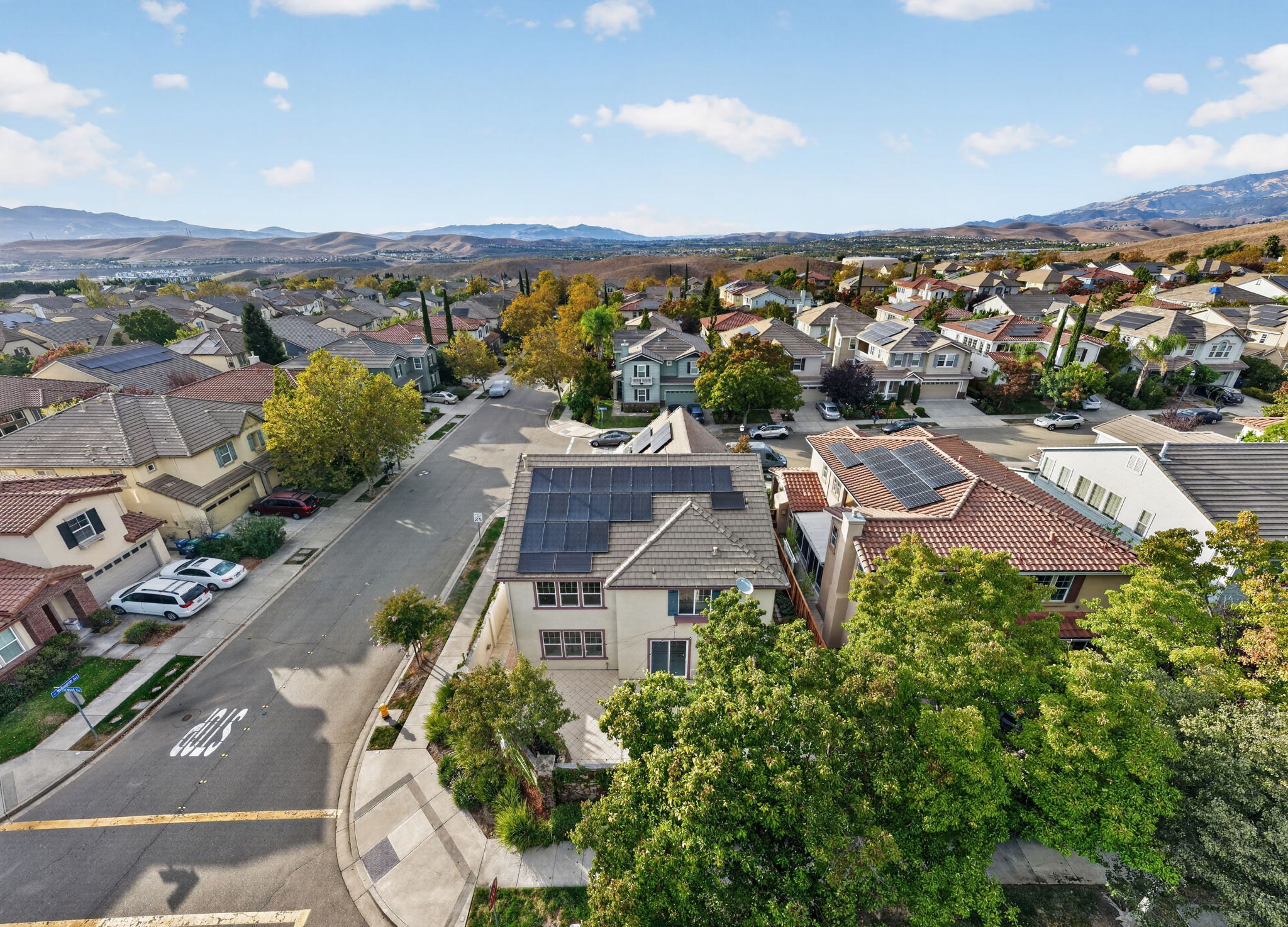
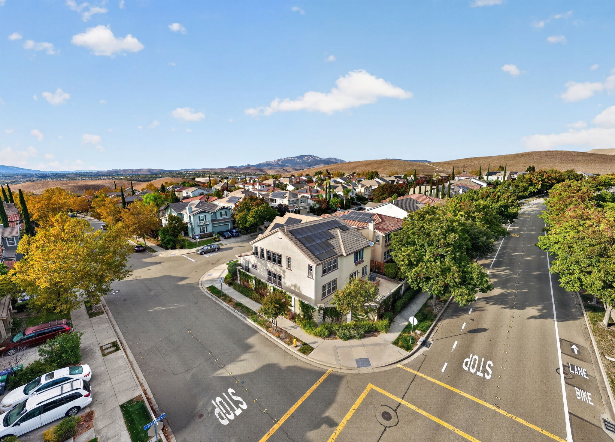
Go around the home with the drone too: straight, corner, straight, corner, then the close up top down.
In the video
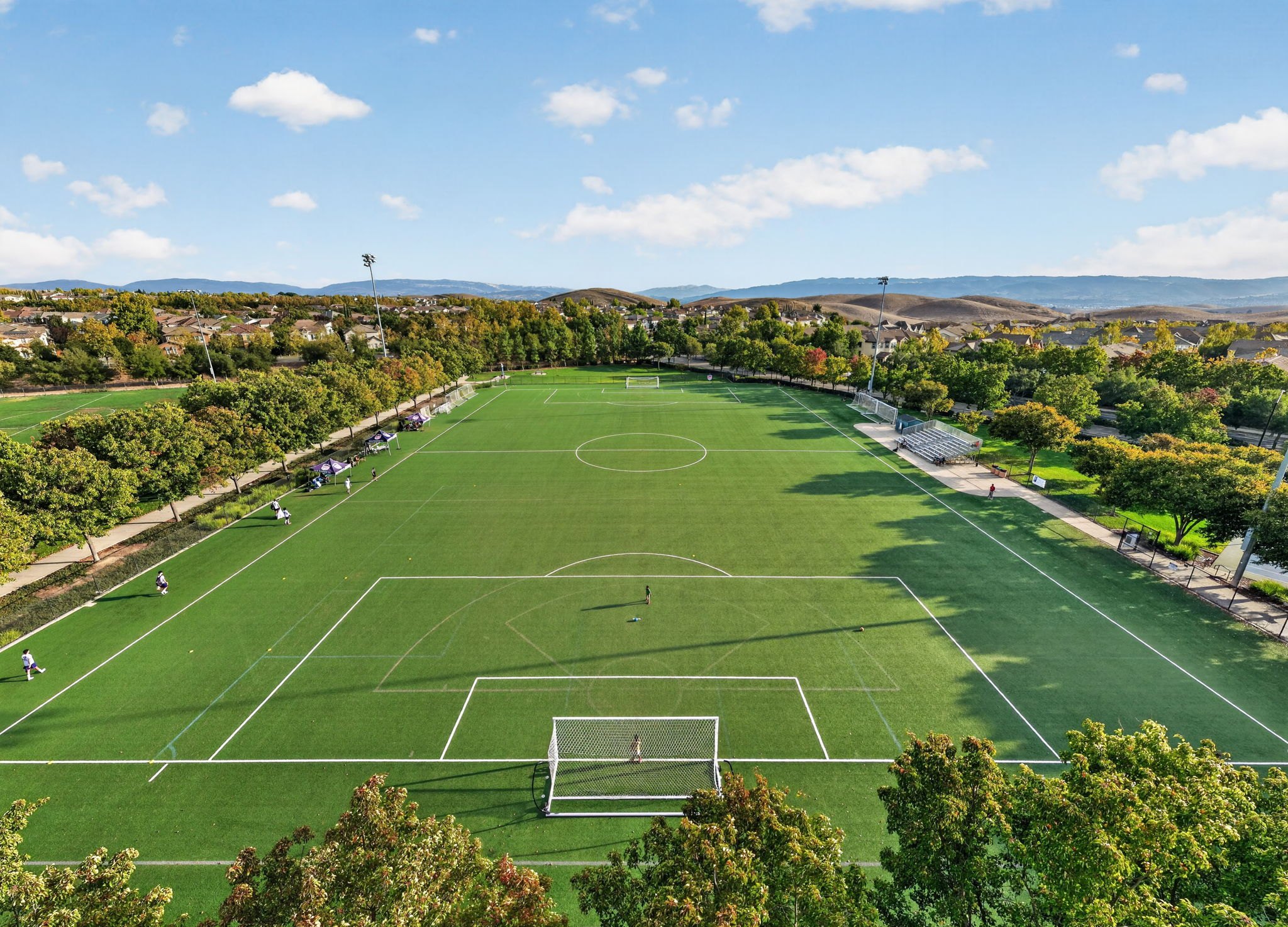
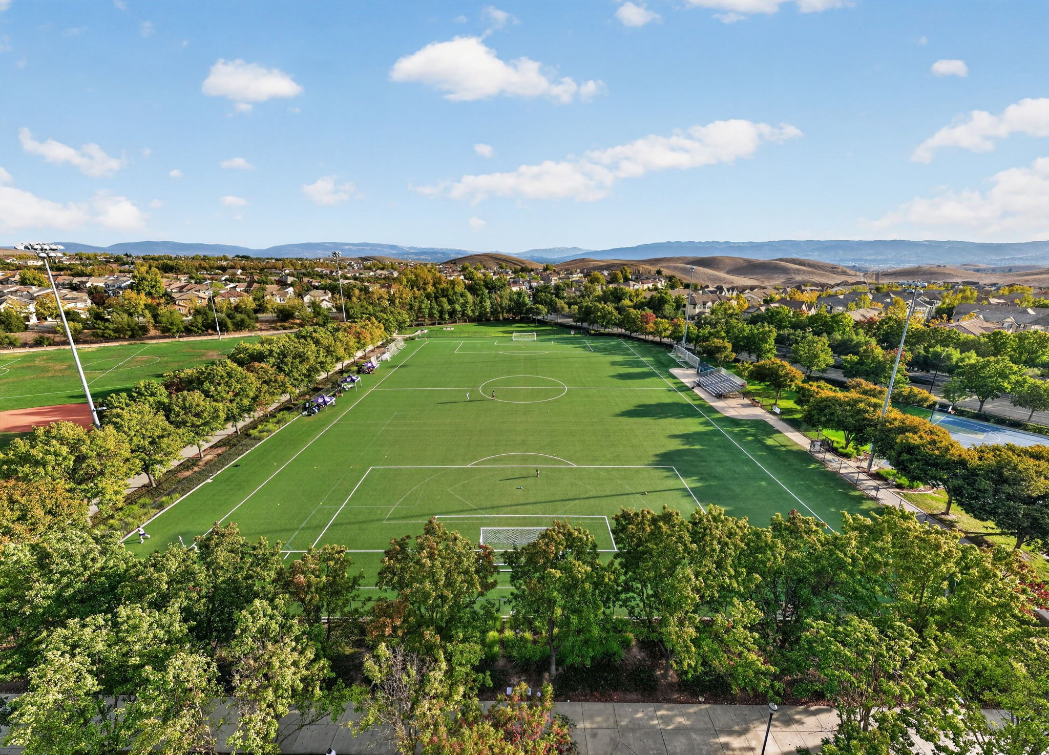
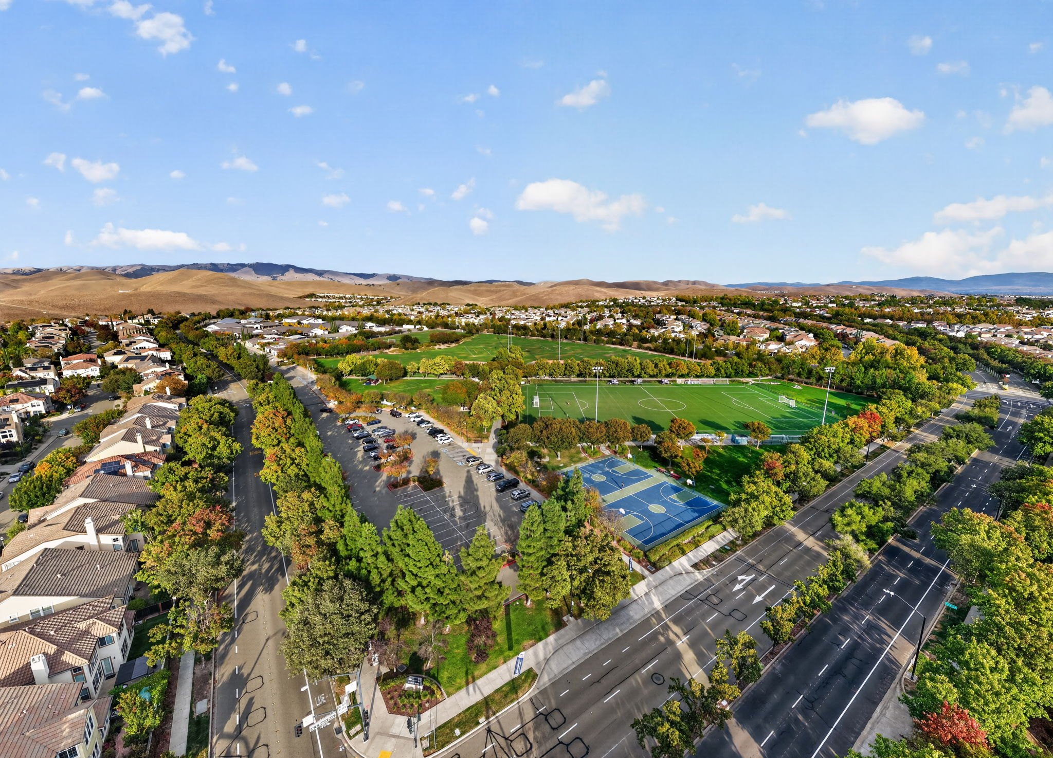
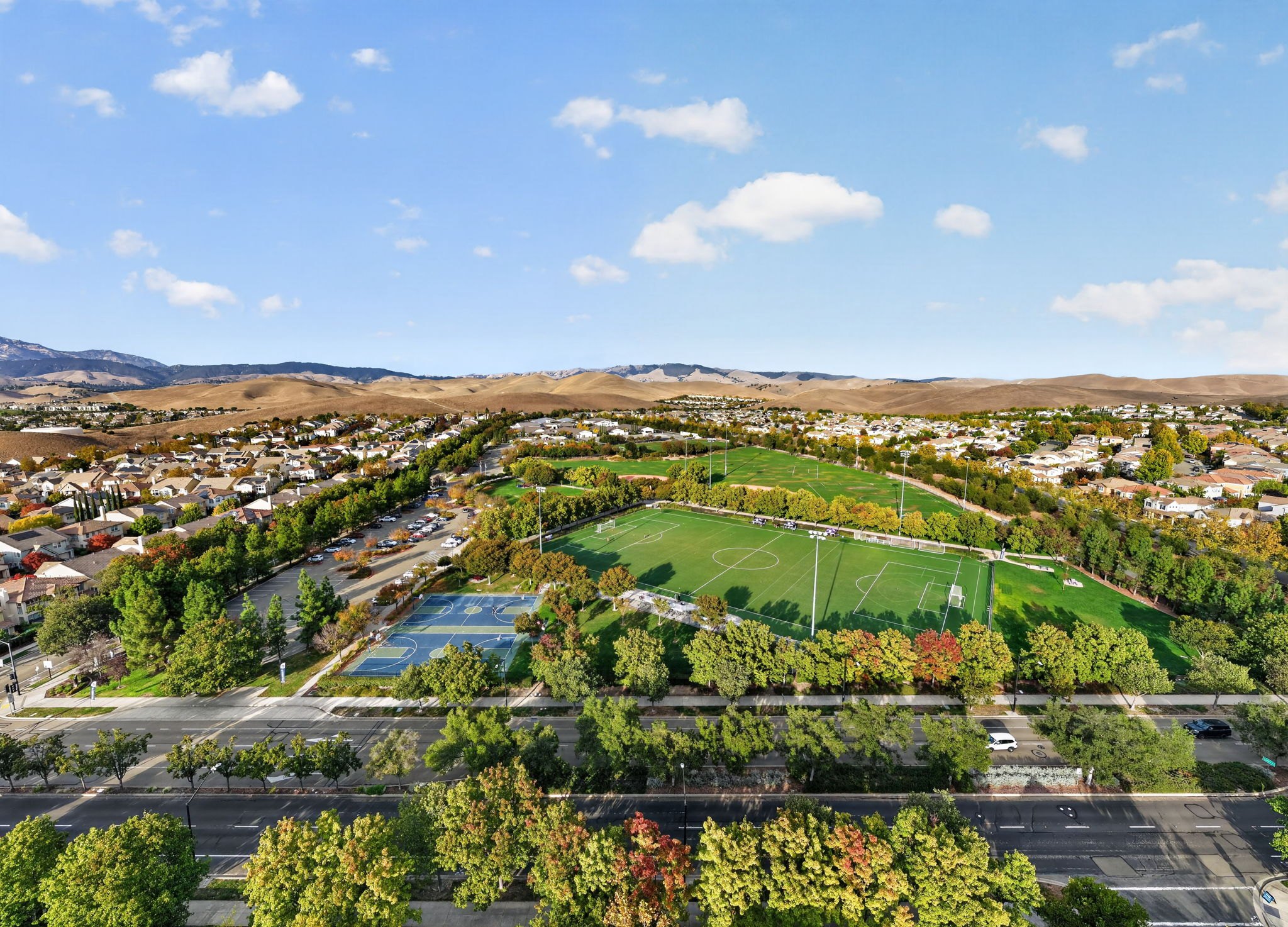
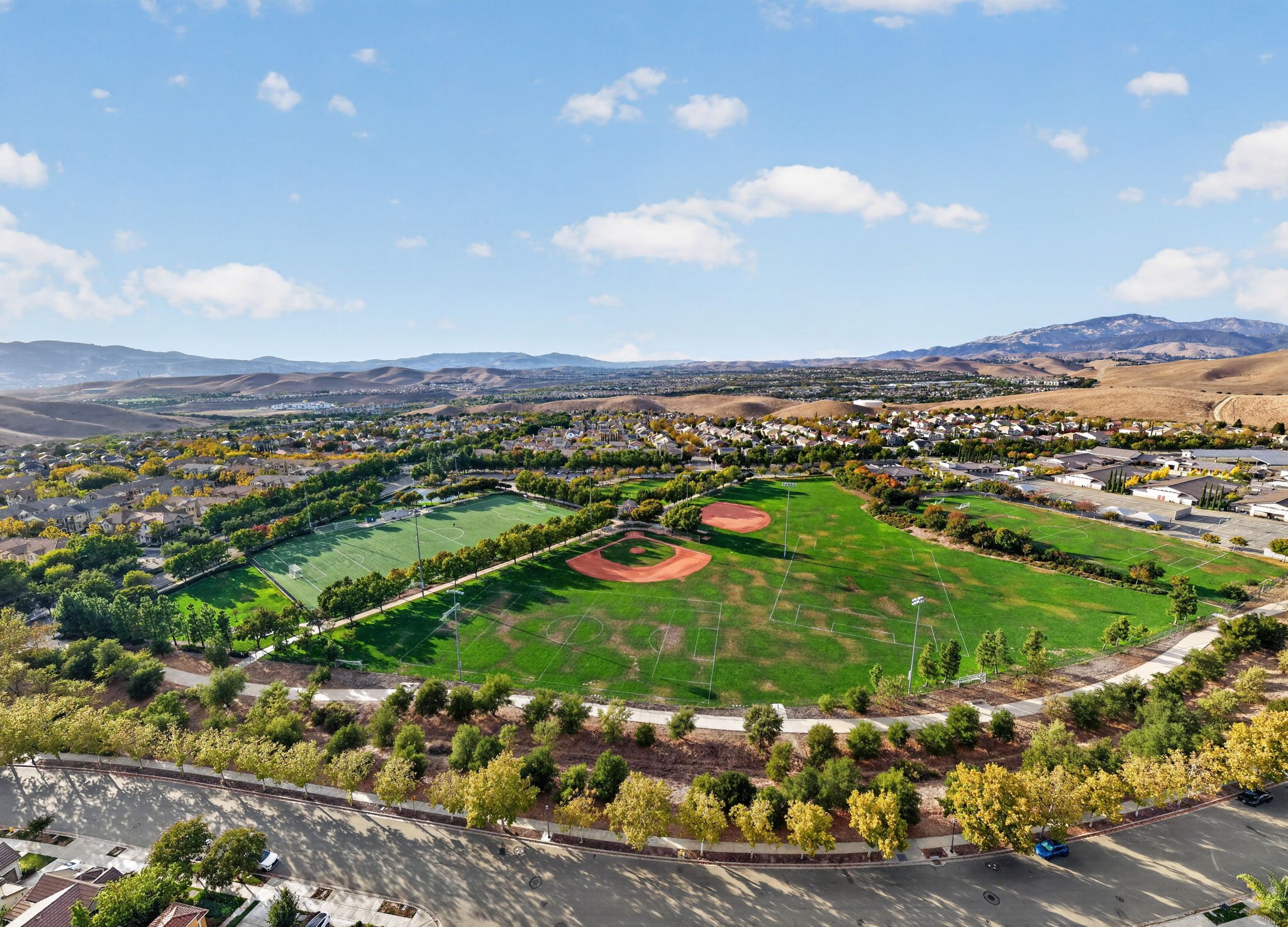
Two wide angles of the park nearby. I would normally say choose one, but I like them both, so I kept them both.
The house is actually over here, but this one focuses on the park. Then a straight on of the park.
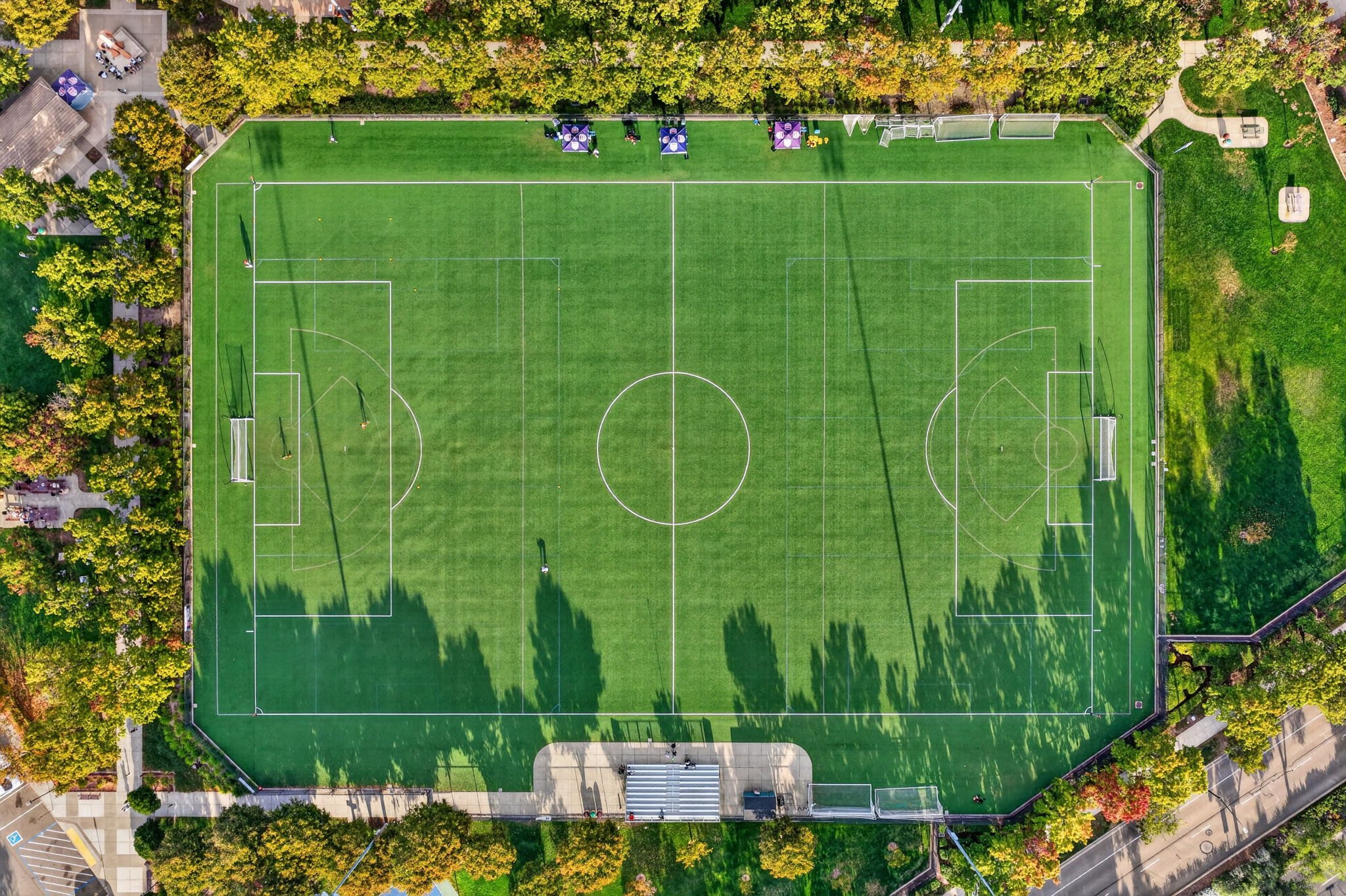
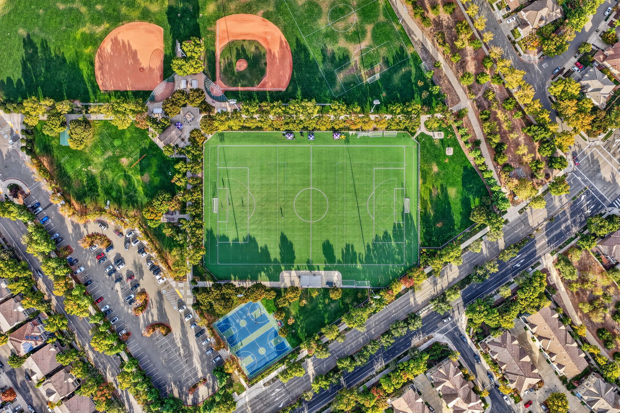
Top downs of the basketball courts and the soccer field. The courts sit right in the center square. For one soccer field shot I flew way too high to try the same rule: don't do that.
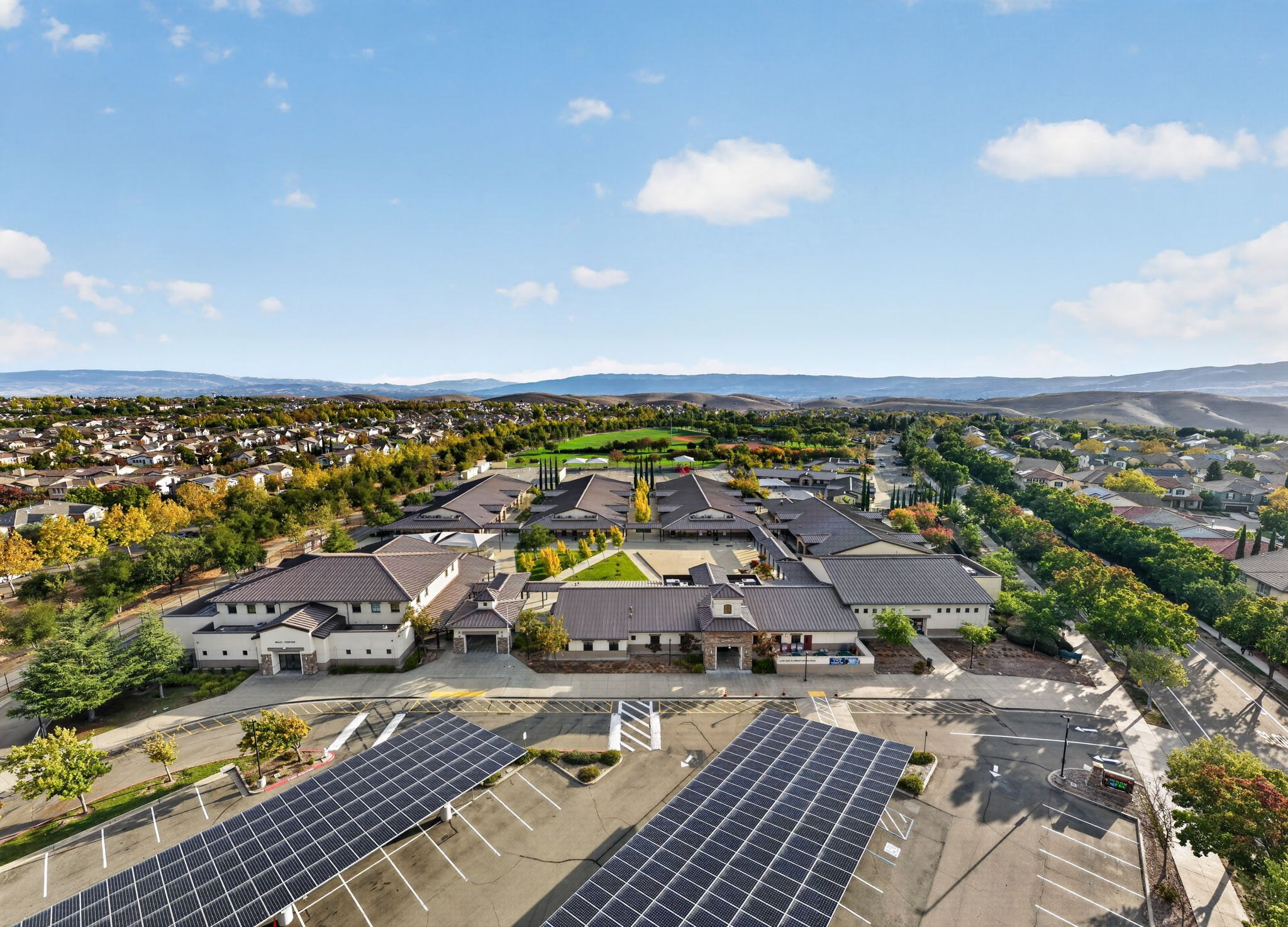
The rest are under 400 feet: a wide angle, then the school with the park behind it and the house over here.
The close up top down, then a regular 1x zoom. I tried the wide angle and liked the 1x a bit more.
Part 9
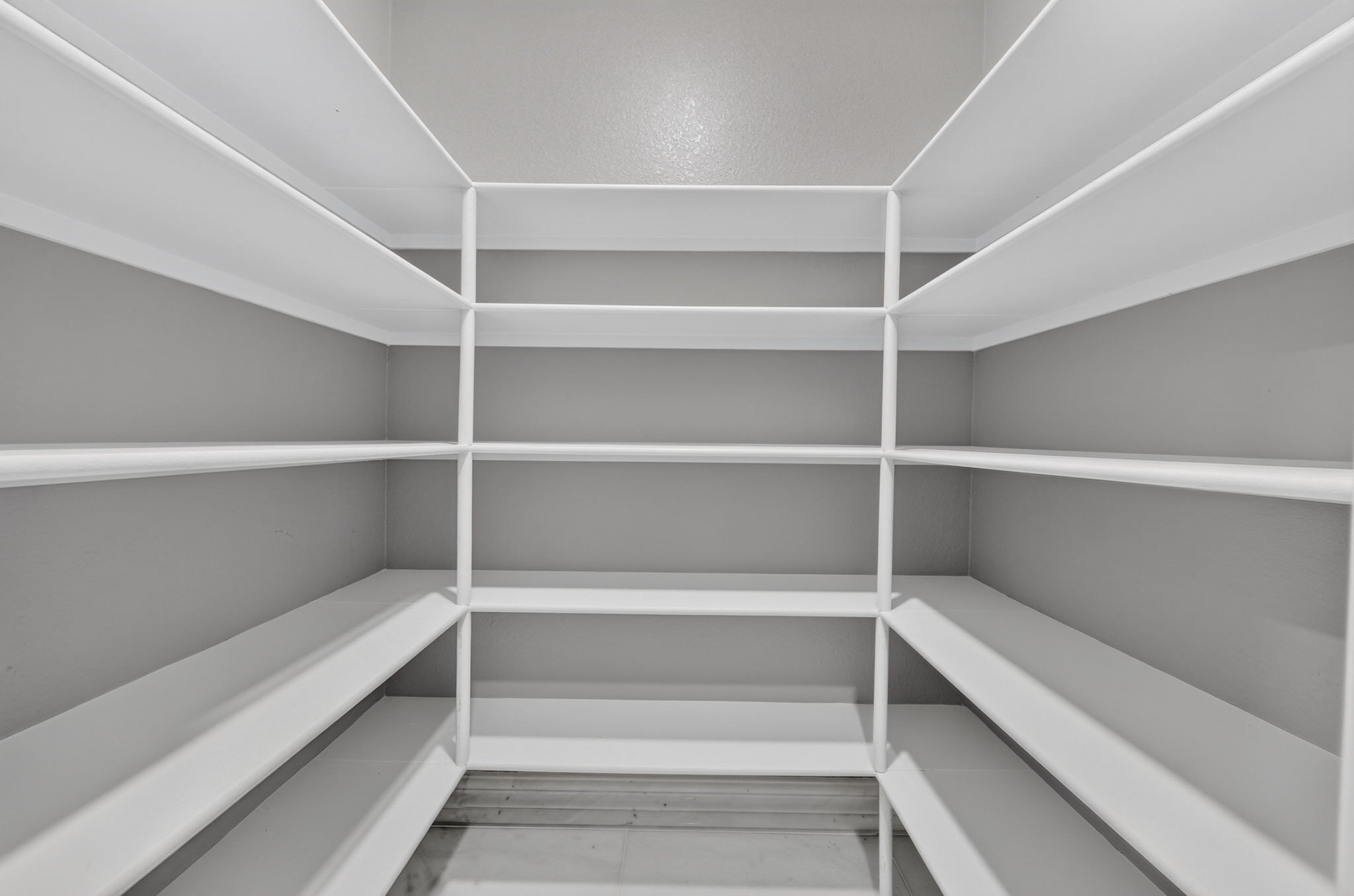
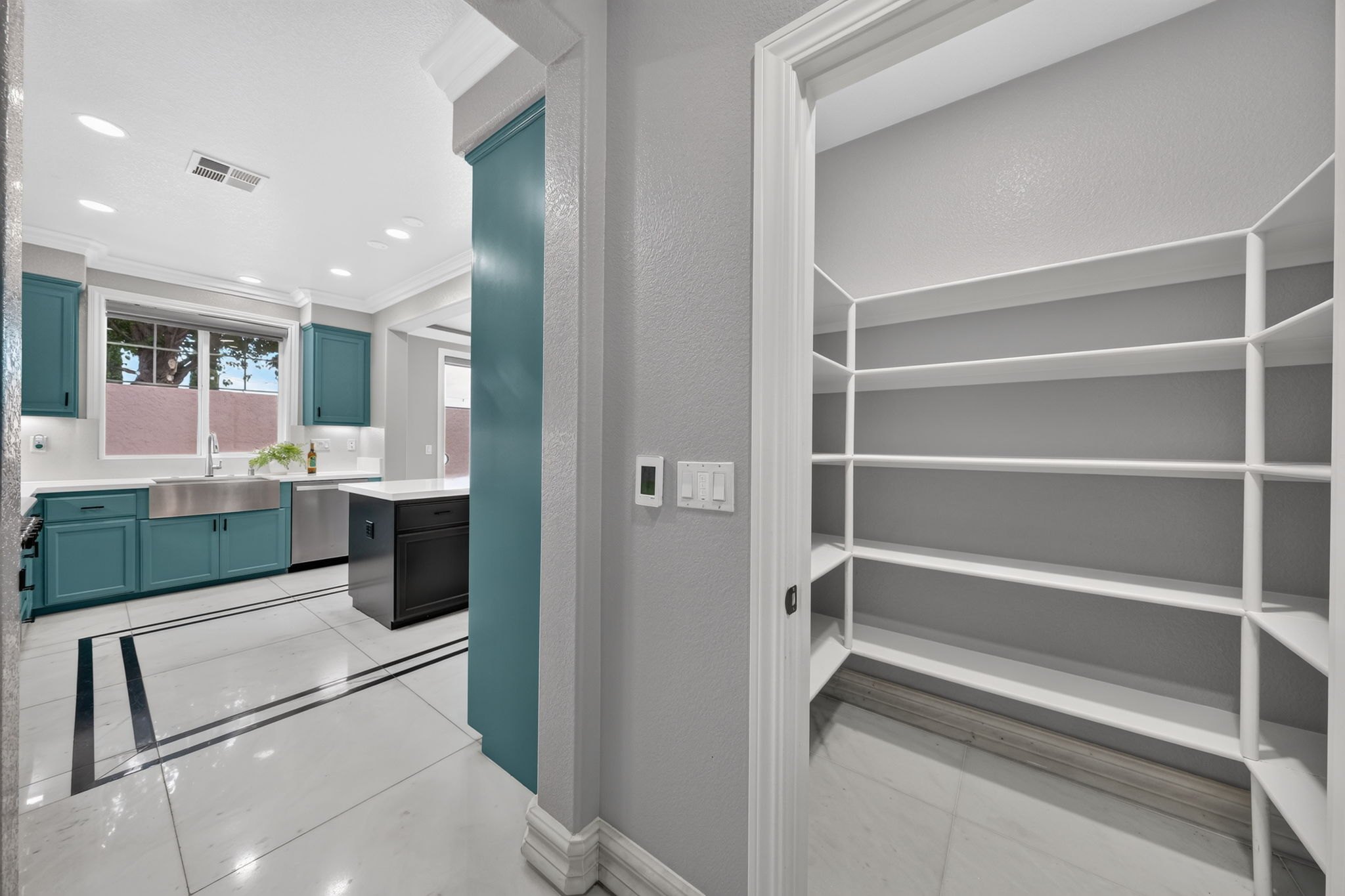
Two shots of the same small space: keep the better one and delete the other.
Two shots of the pantry. This one is meh and I like the other one more, so I would delete it.
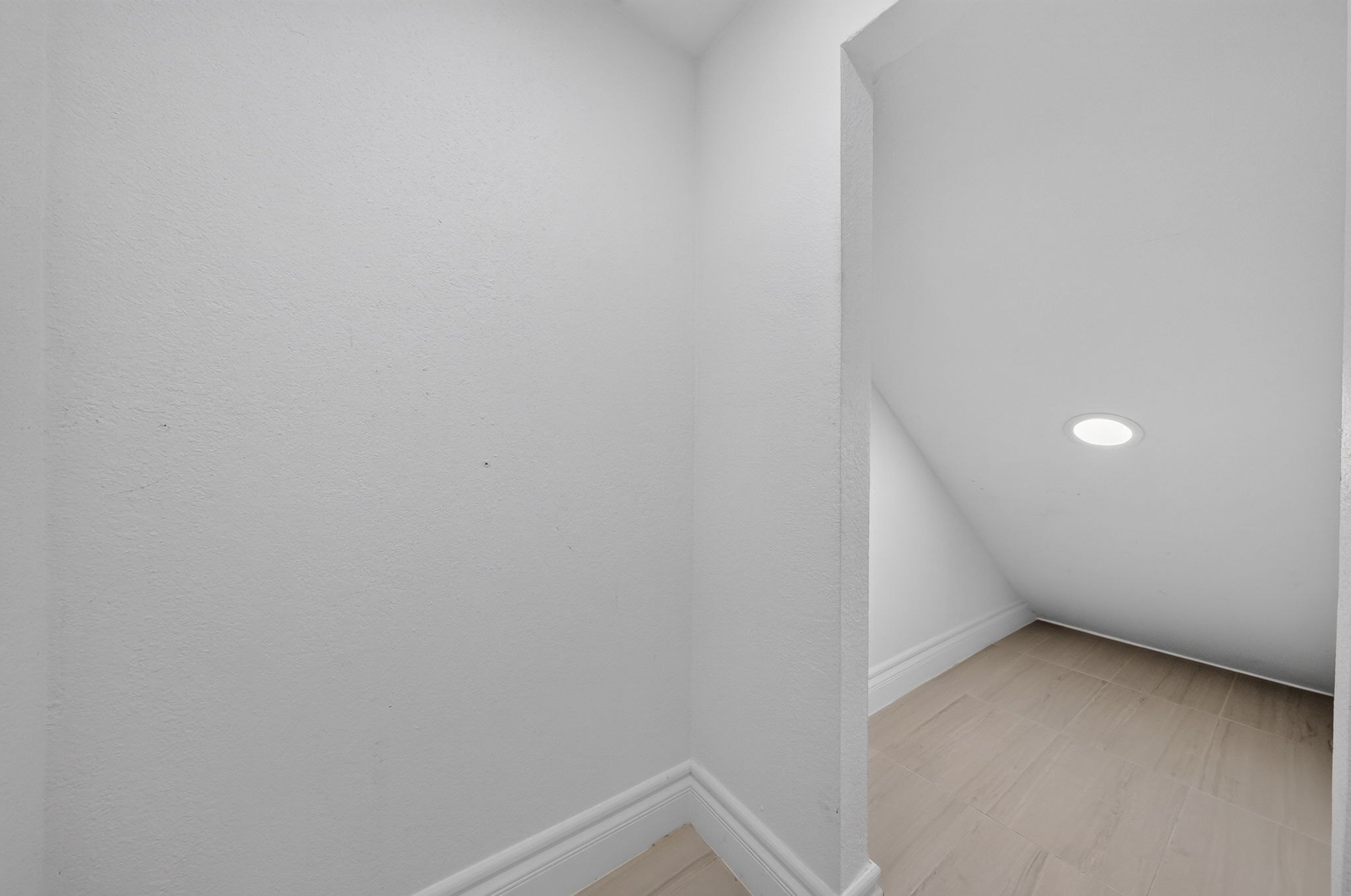
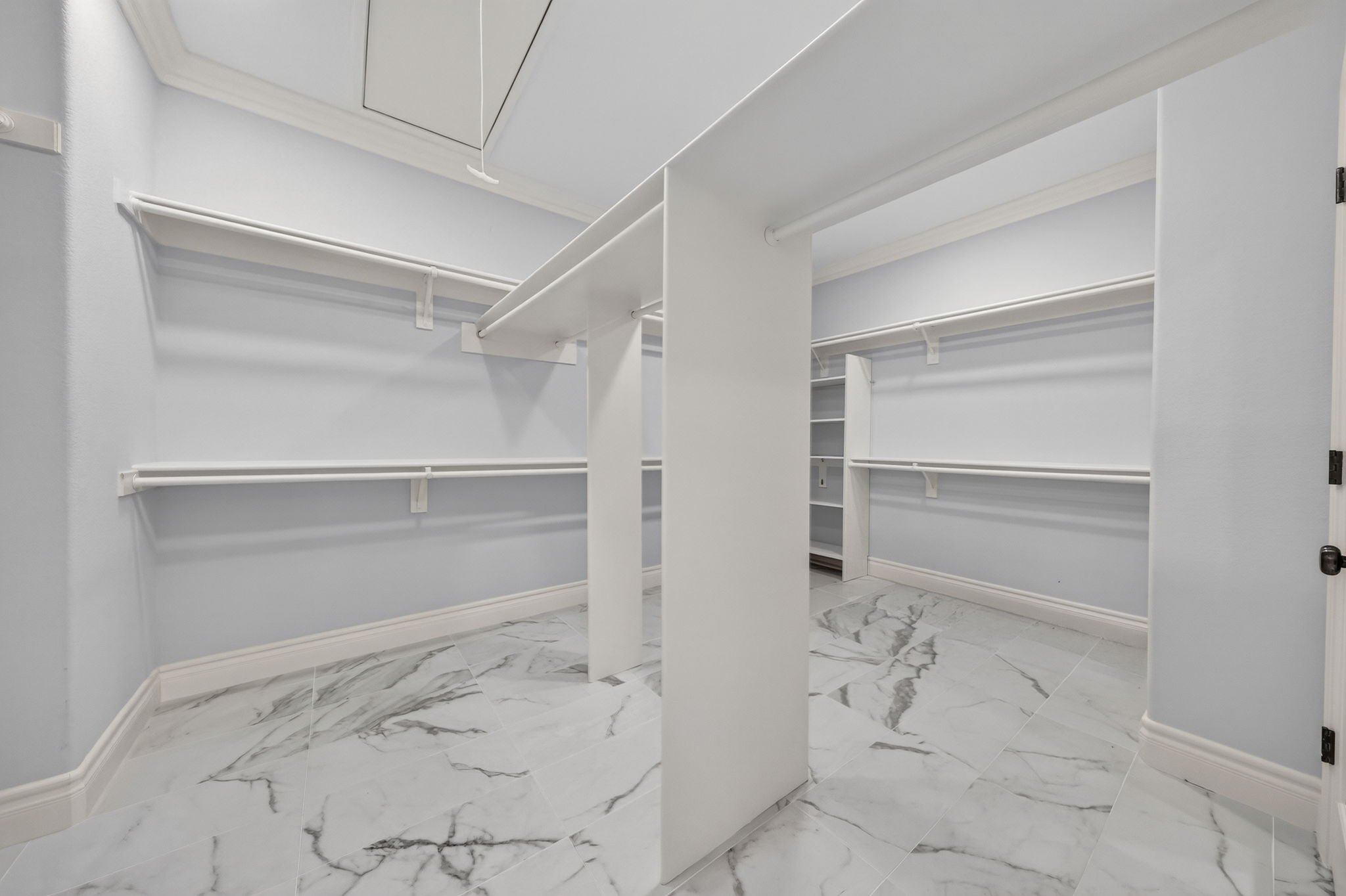
A plain closet shot I wouldn't get. A wardrobe like this one I would.
Part 10
When the client asks for two versions, deliver both so they can pick and choose. You don't have to do this unless they ask.
You don't have to do this unless they ask.
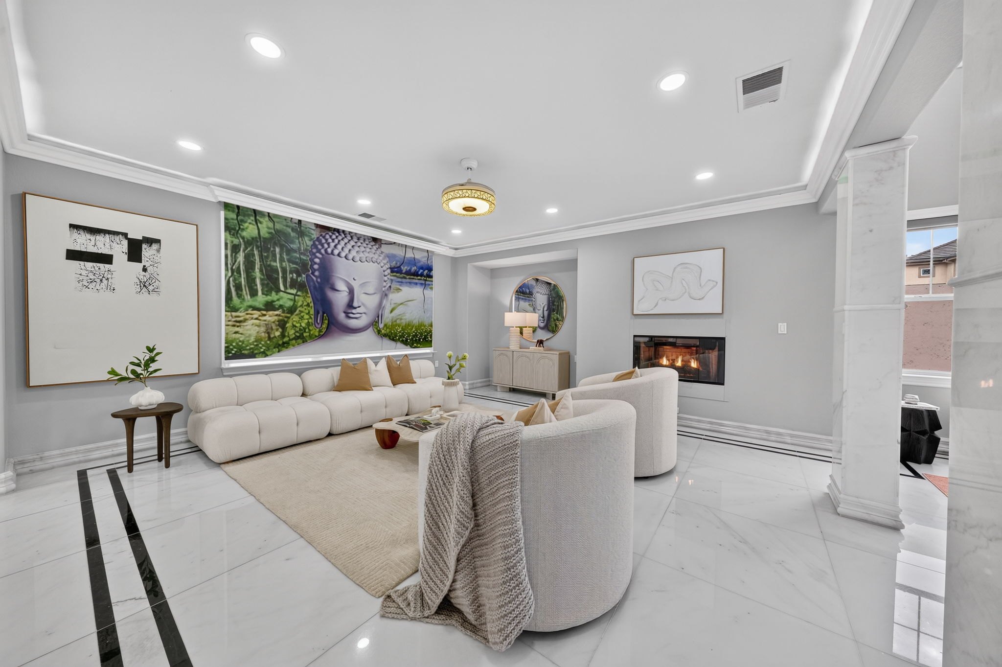
For this client we edited the lights from green to white and gave them both, so they can pick and choose.
Same thing here: they asked for one with the Buddha painting and one without.
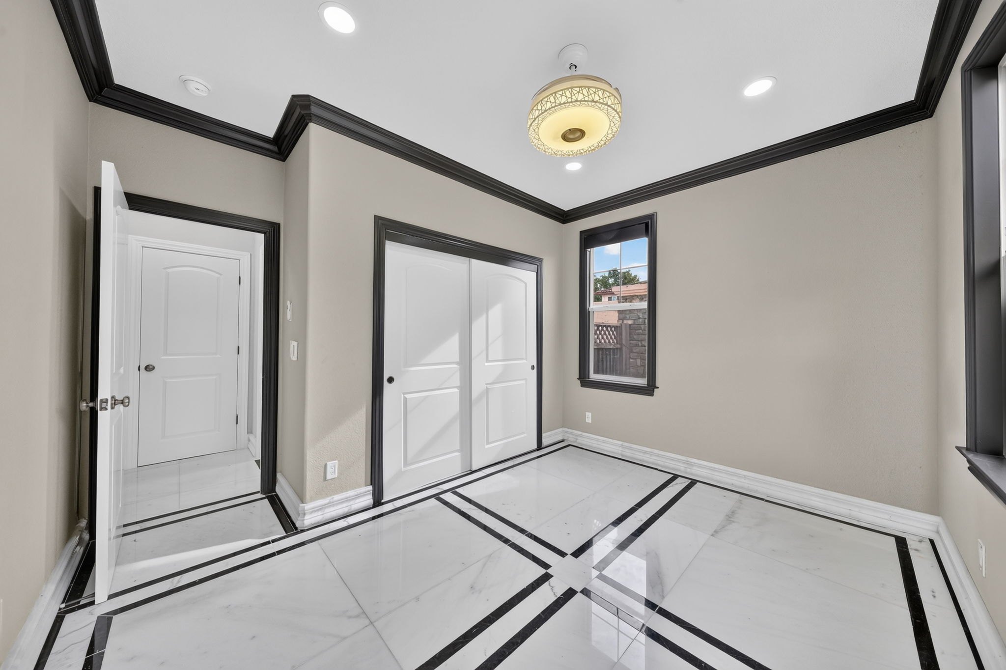
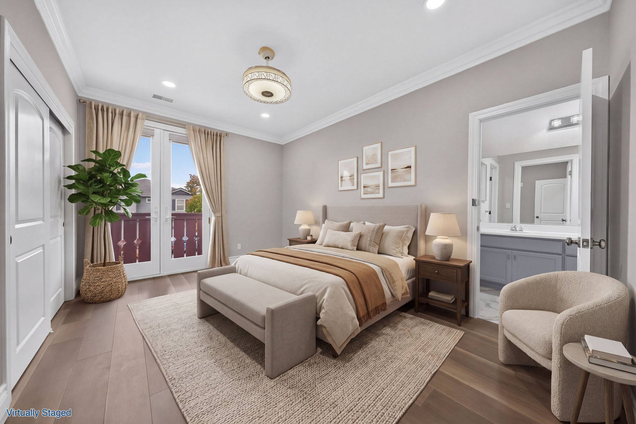
One with the door closed, one with the door open. The closet half open was what they preferred; I recommended no.
One with the closet door open, one with it closed. You don't have to do this; the agents asked for it.
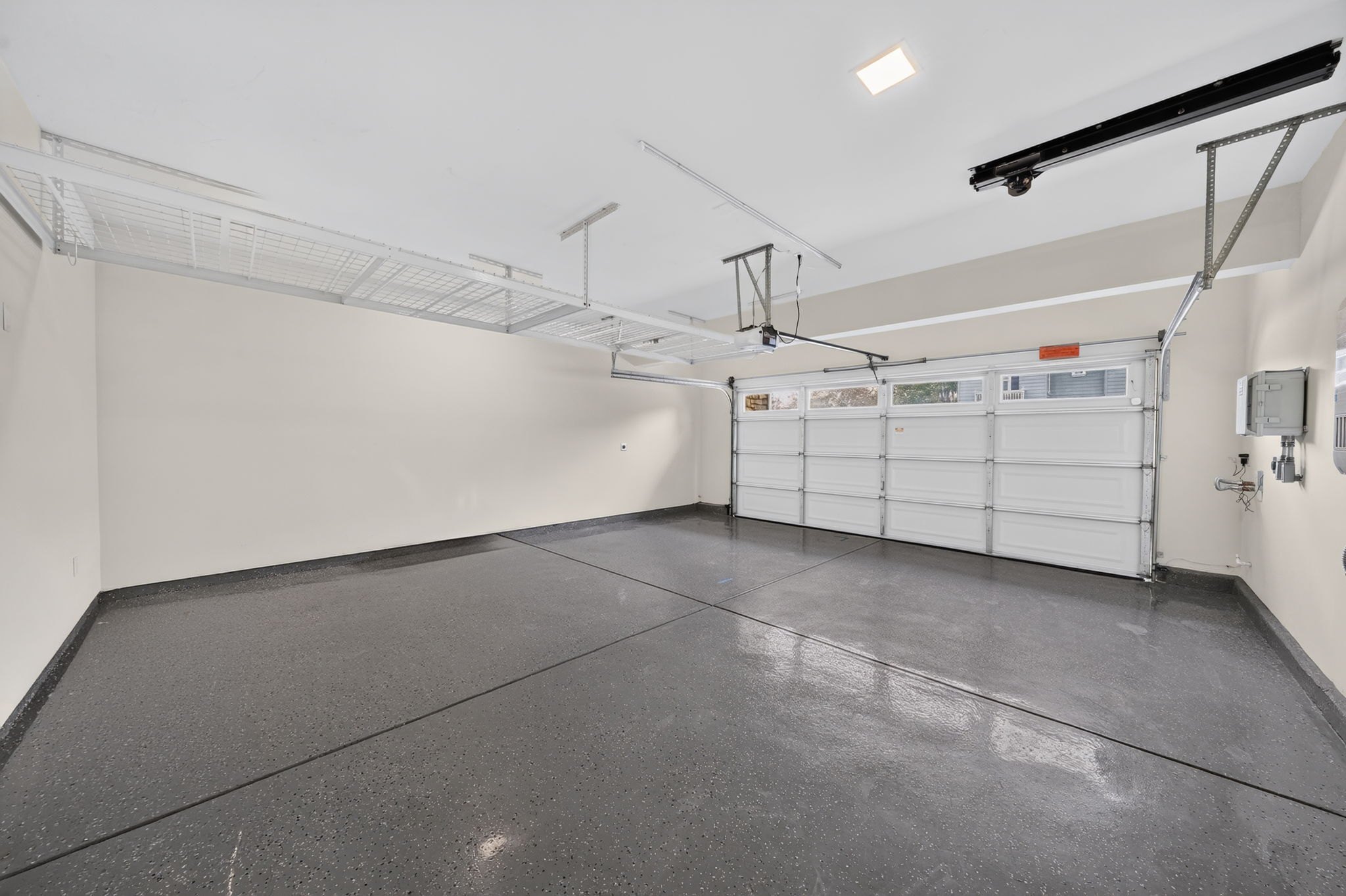
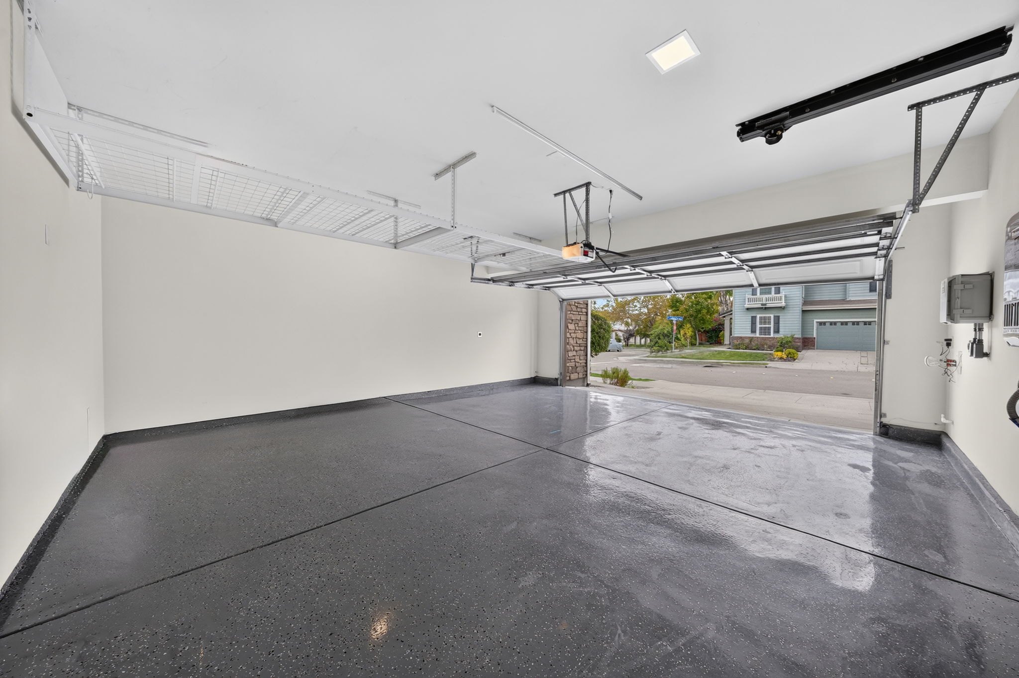
They asked for the garage closed and open. I would have just done one with it closed.